Posted on

Light me…

Here’s another thing I came across in my Big Clean Up.

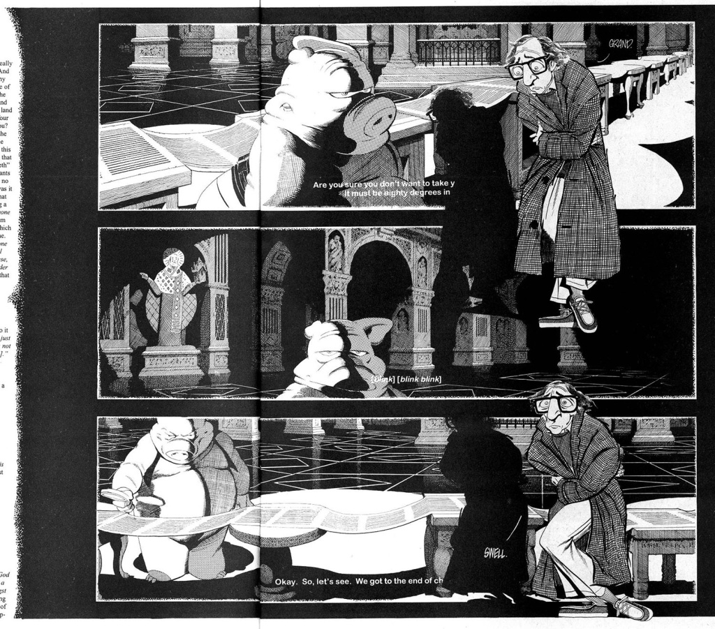
Way back in the olden days I had software called “3D Home Architect” running on our pre-Pentium 486 computer. I could design and furnish a room in floor-plan mode, then click on the 3D render button and go for a coffee or go back to my drawing board for awhile as mere tens of minutes later I’d have something that looked like this that I could print out:

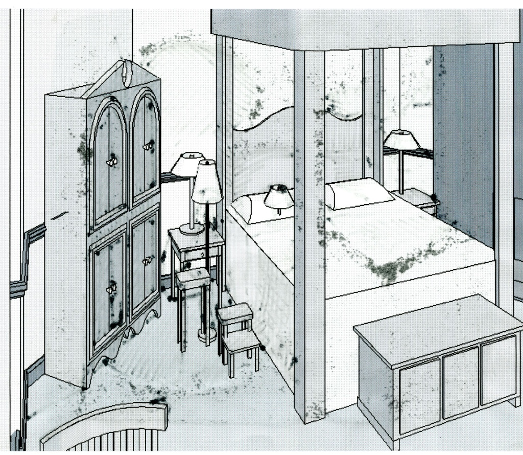
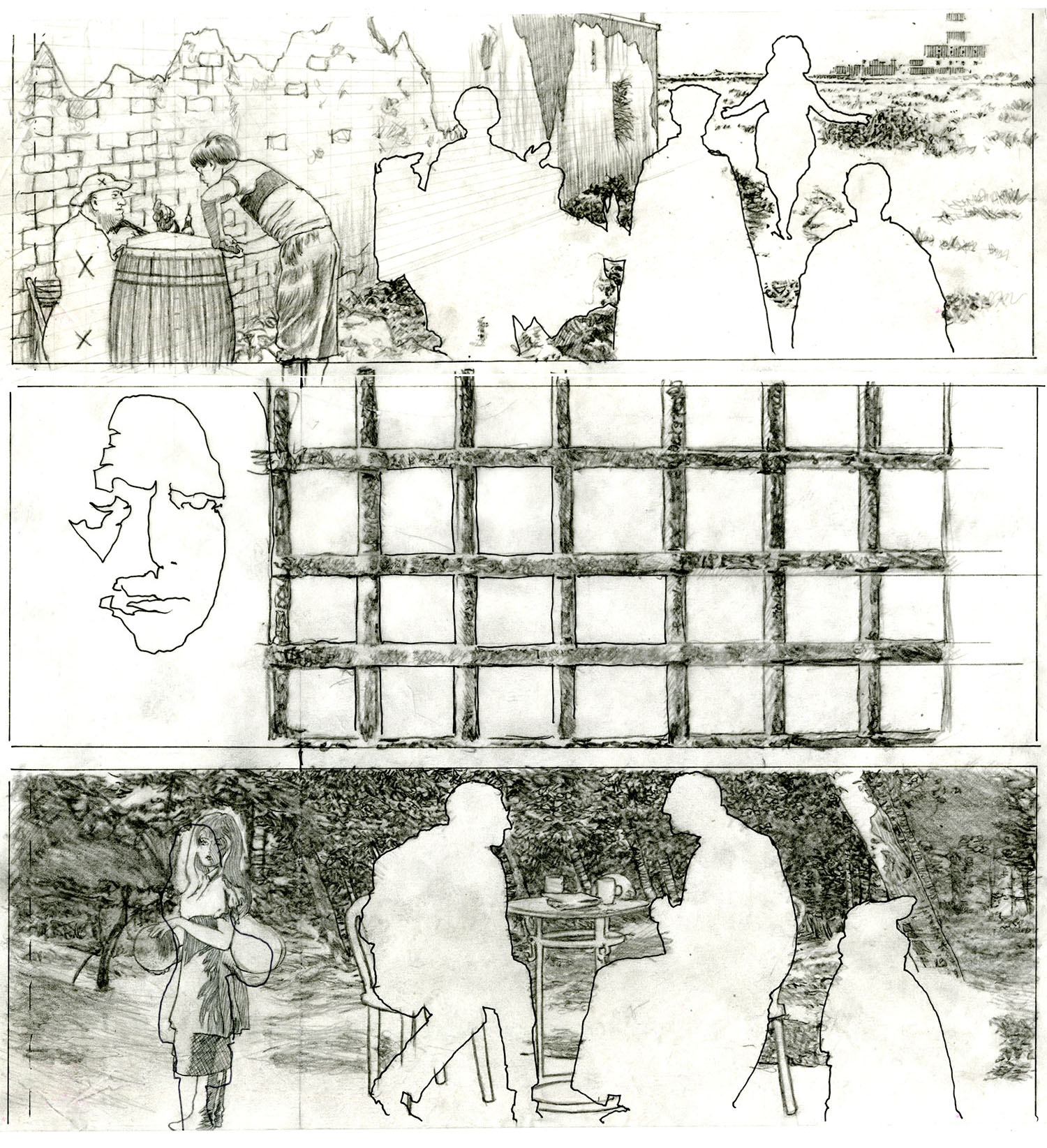
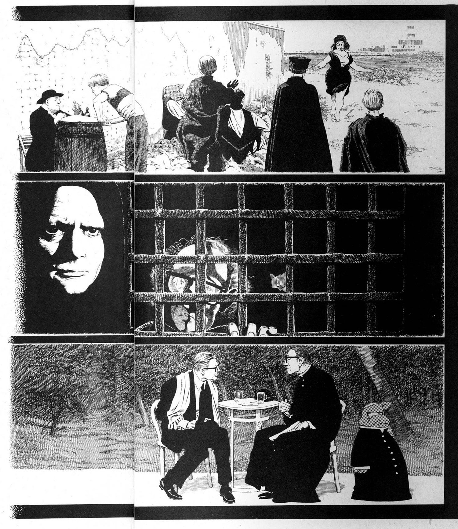
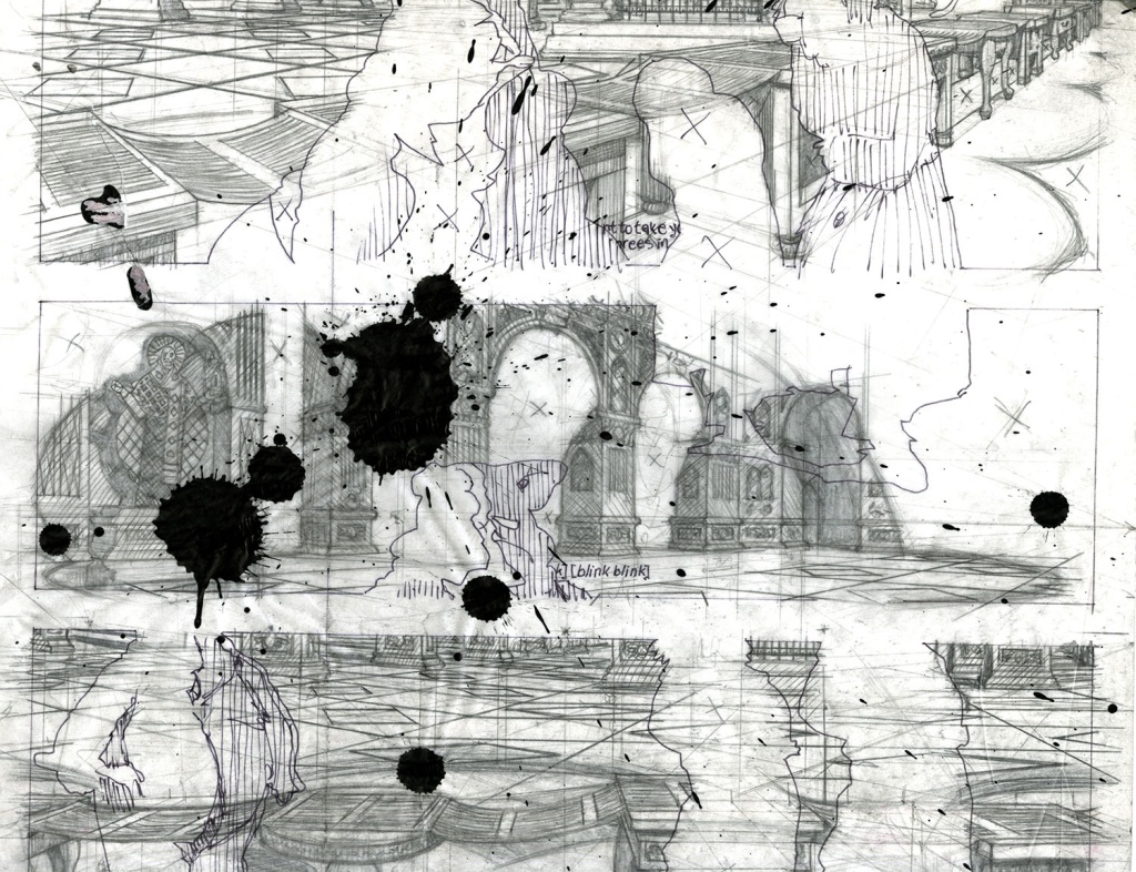
The lamp on the pillow and the floor lamp represent the characters. Lamps were easily resizable and positionable making them a great stand-in. The black splotches are from me drawing on back of the paper, on the light table, with a marker, very quickly figuring out what the lighting might be for this scene:

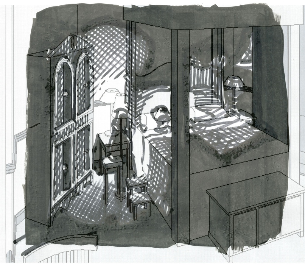
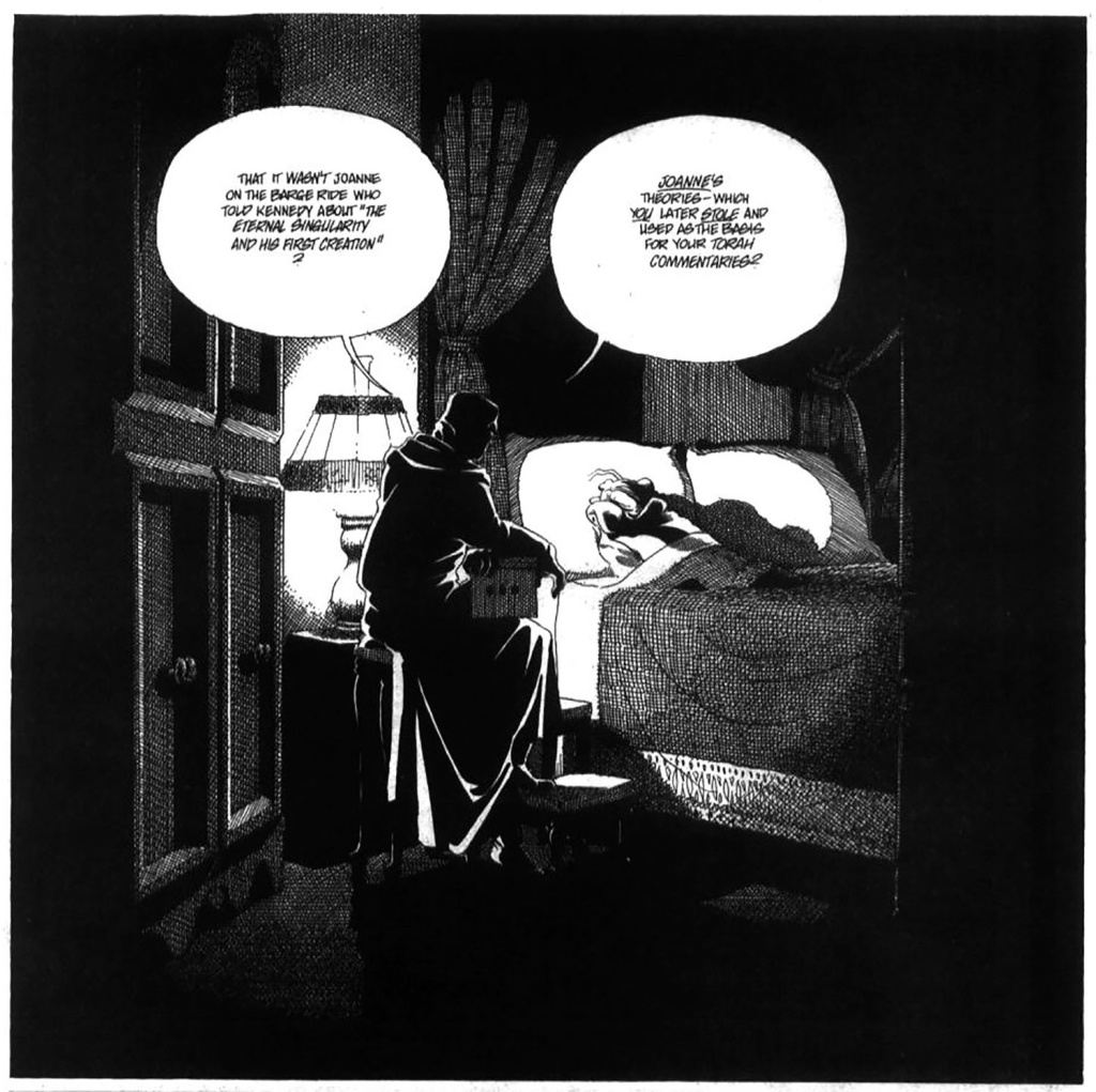
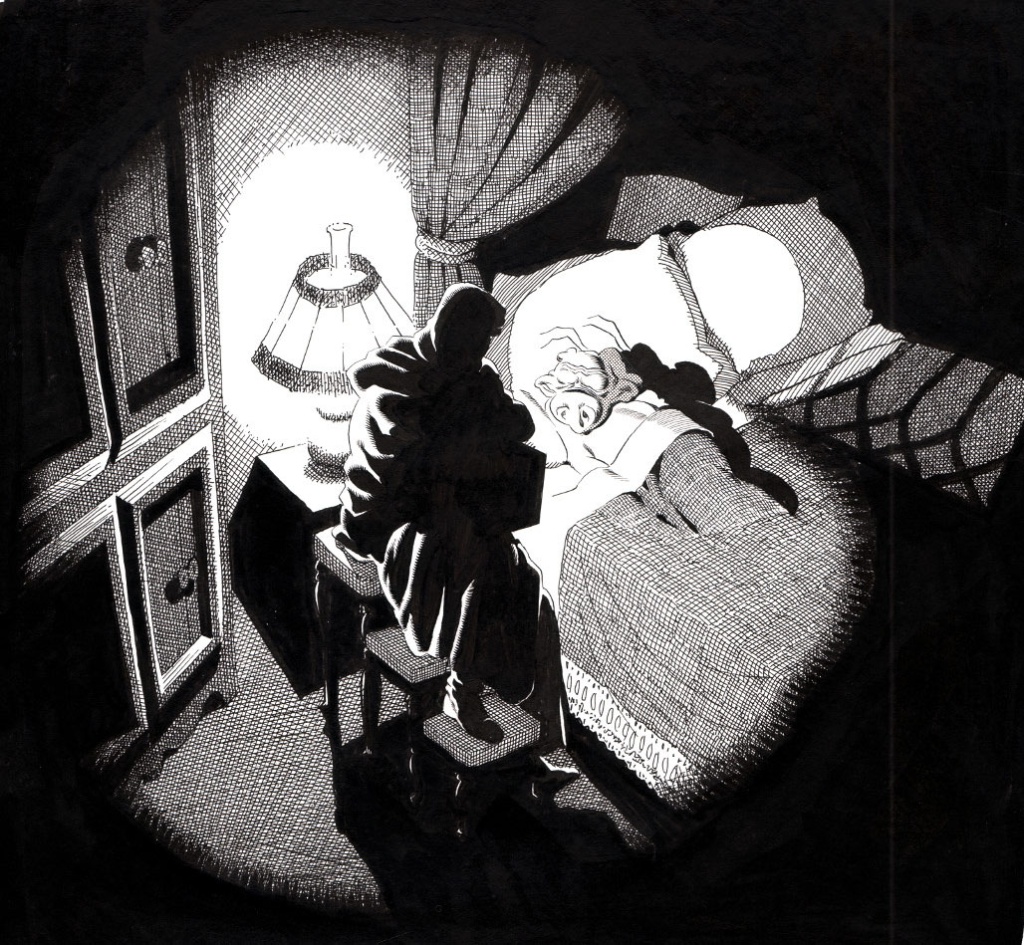
This was used as a guide to for the final renderings:


Posted on

Without a trace…

Here’s a good example of why I continued to use the “tracing paper transfer” technique. (Other than the obvious benefit of being able to… you know… trace stuff.) All of these roughed-in lines and perspective lines and otherwise unwanted lines would have to erased had I done them on the illustration board:

But by working out all that stuff on the tracing paper and then transferring only the lines that I intend to ink, I’m left with a nice, clean, smudge-free image to work on with very little-to-no erasing needed once the inking is done: Which is a very good thing as sometimes erasing would lighten the inks from black to various shades of grey, severely affecting its ability to reproduce properly.


Posted on

Pencil & Ink…

On this page I only did a background on the middle panel. I am pretty sure that Dave TOLD me to leave all that white space. I would very rarely leave a panel blank since it was… you know… my JOB to put in the backgrounds.

All that officially sanctioned empty space would give me the chance to either A) get caught up or B) spend more time on the existing background. Guess which one I chose:

Although, this is one of those instances where I like the pencil version better than the ink:


Posted on

Ghost Girl…

Here’s an example of a rare occurrence where Dave had me change what I’d done on the backgrounds.

In the bottom panel on the left side I put in a figure to balance the composition. Which I also did in the first panel.

(Another rarity: me pencilling and inking people).

I tried to shoe-horn her in there. Apparently I couldn’t decide if she should be facing left or right.

Once the whole page was inked Dave told me that the girl was from a different Fellini film (or something) and that he WANTED an unbalanced frame to emulated/parody artsy-fartsy types of movies.

I almost invoked the “Interior of a Submarine” clause (in which Dave told me that I could do whatever I wanted with the backgrounds) but I was unhappy with the way the girl turned out.

(Usually, when something was a LOT of trouble to make fit, it meant: leave it out.)

So…

In the bottom panel, on the left, you can just make out where I used white-out to cover the figure and then attempt to fill in the background.

(ANOTHER rarity: using white-out and inking on top of it… *yuck*bleck*gag*swoon*)

At least my little figures in the first panel made the cut.

Posted on

Tracing Paper Ink Blot Test…

As seen in last week’s post, here’s an example of why I needed to be able to visualize the entire Sanctuary:

To create the backgrounds, I would outline on tracing paper the panel borders, characters and lettering that Dave had already pencilled and inked on the illustration board.  Then I would work out the perspective and lighting and rough the whole thing in on the reverse side of the tracing paper before flipping it over and transferring it to the art board (as described in the Aug 18 post).

The tracing paper having thus served its purpose would more often than not find its way to the floor next to my drawing board where it would (more often than not) suffer this fate:

I am really FAR too klutzy to have an open container of ink anywhere near me.