Posted on

Why I Need to Stay Off the Internet…

… and not just for the usual reasons like “doom-scrolling” all the covidiocy out there, but for stuff like this…

…from a Facebook post about a CBR.com article titled, “10 Comic Writer/Artist Duos That Have Worked Together The Longest”:
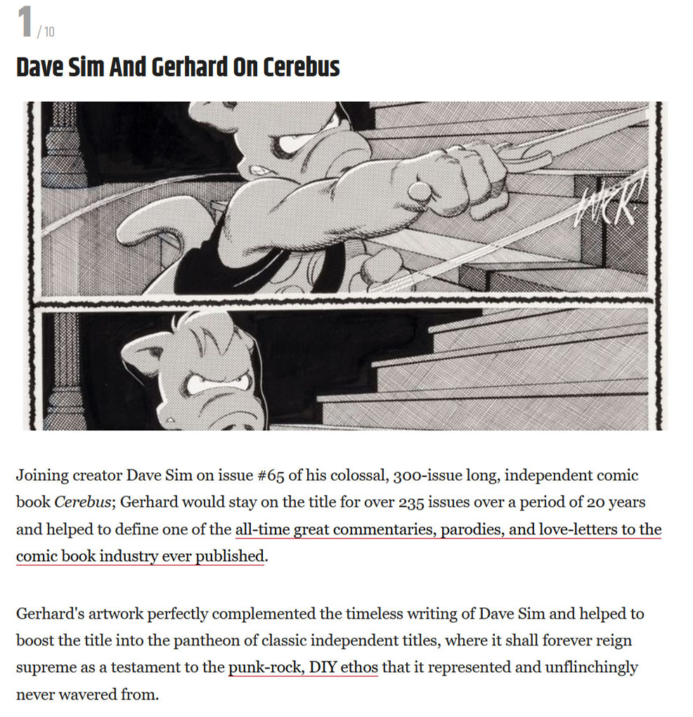
…so …wow, right?


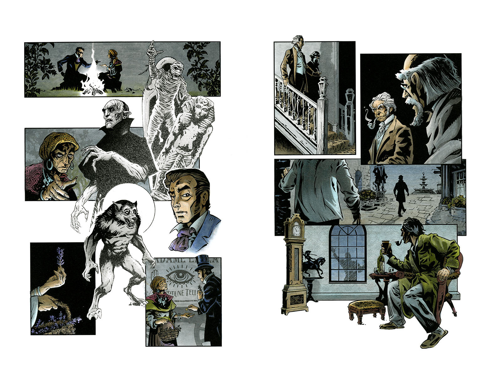
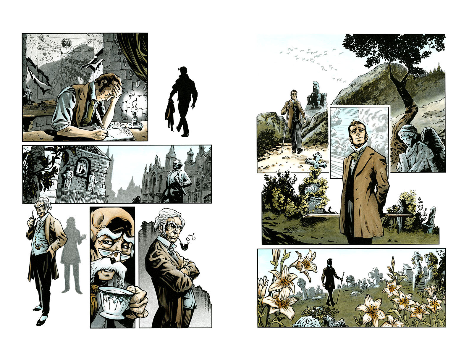
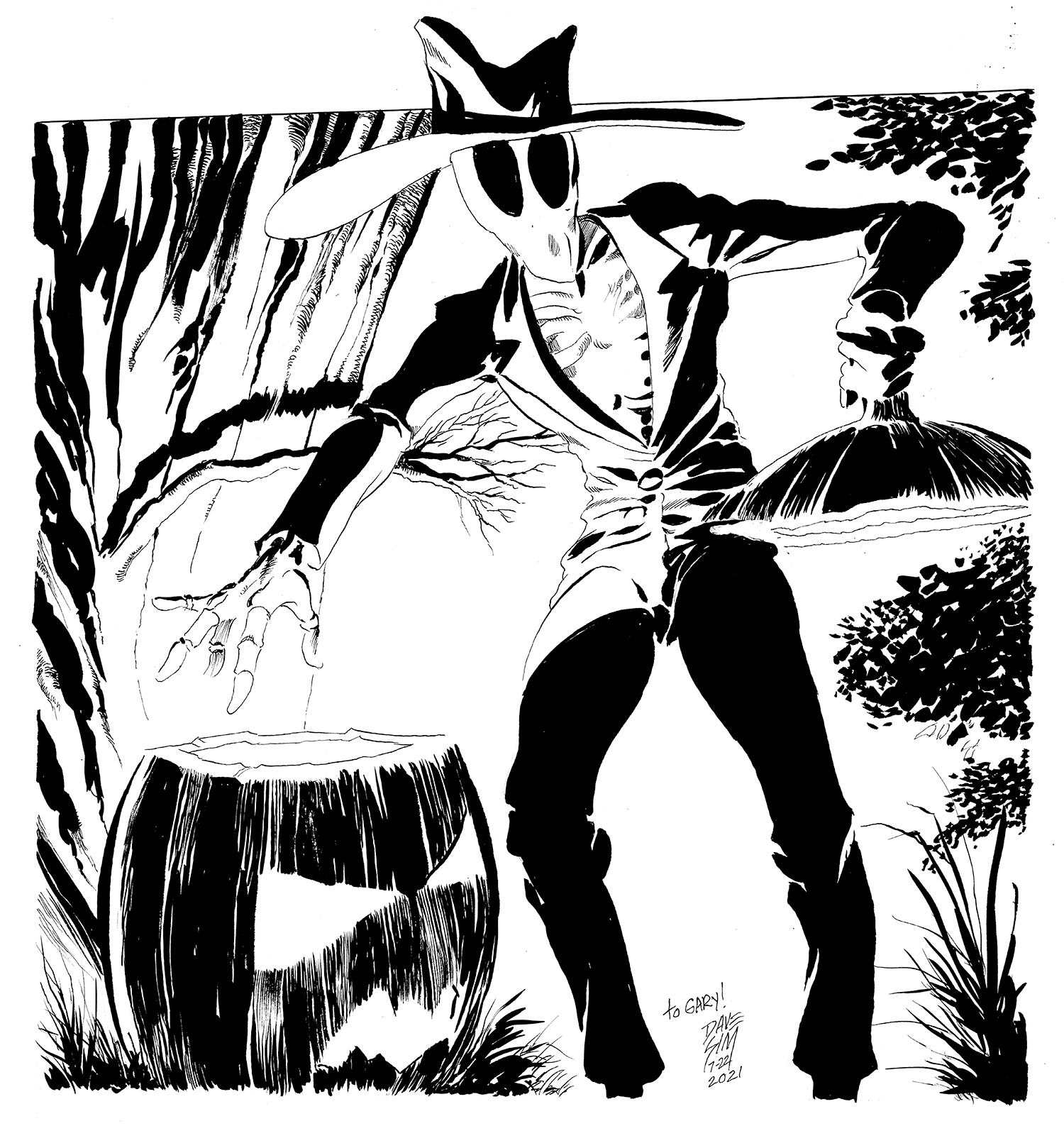
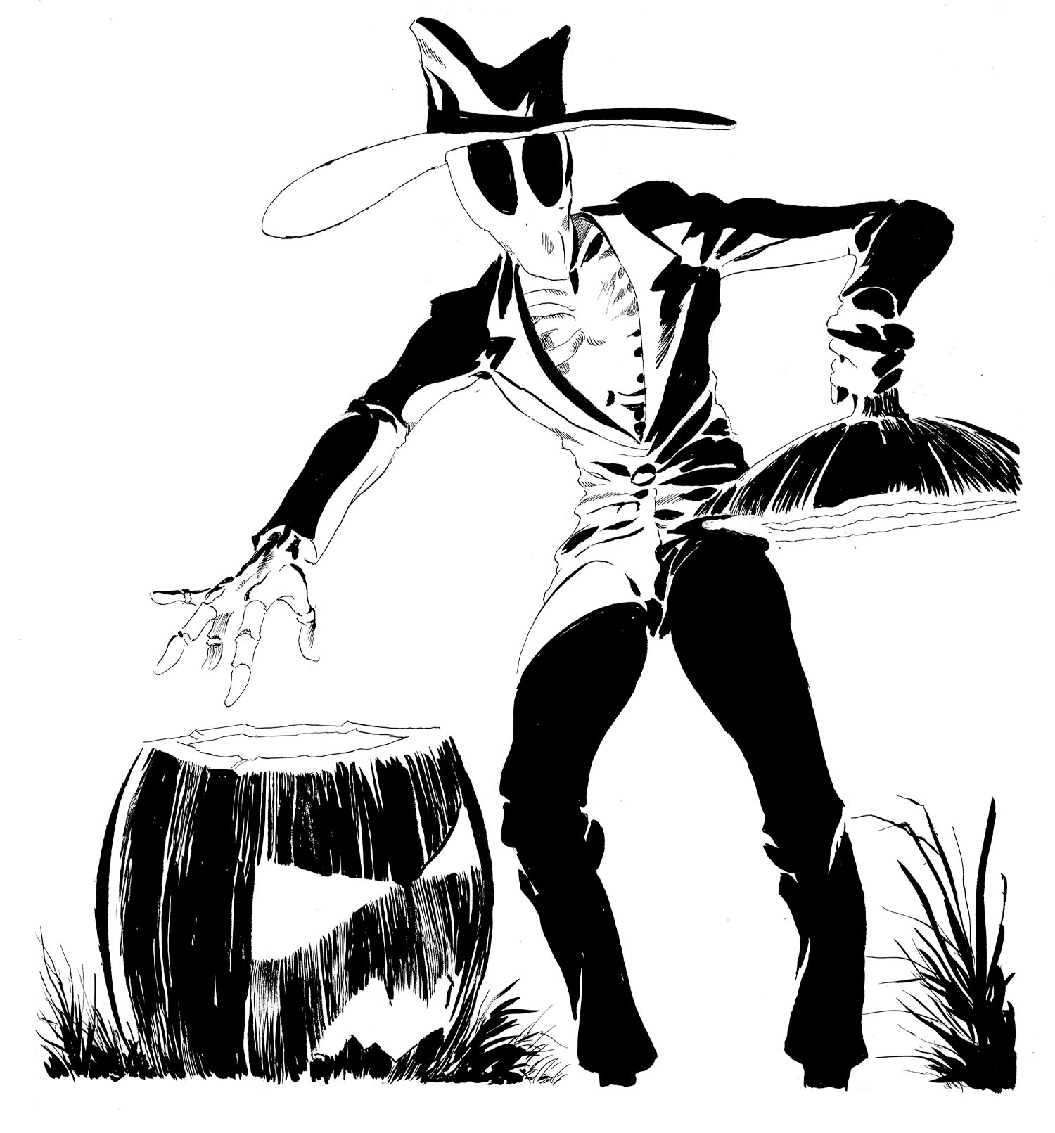
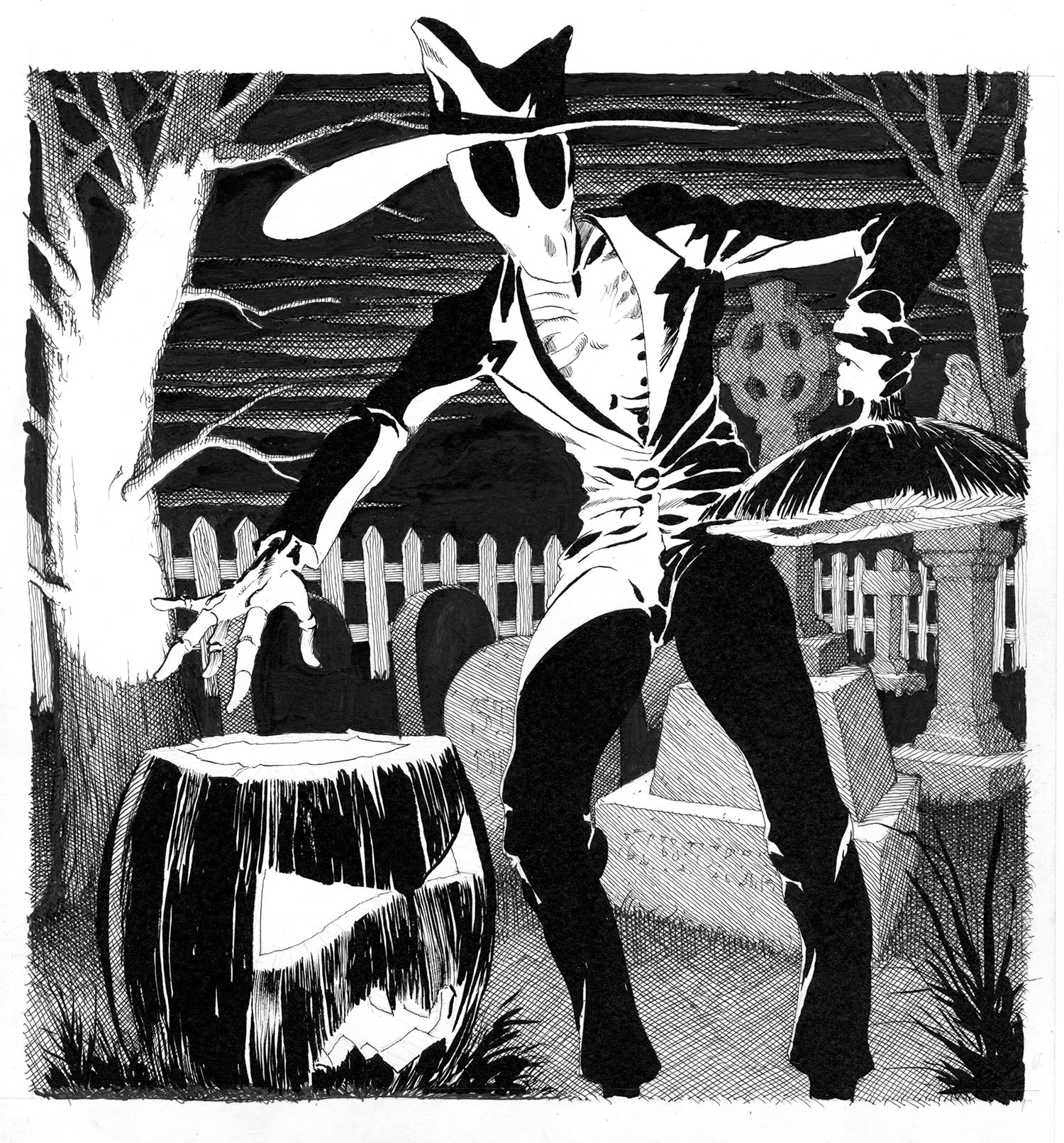
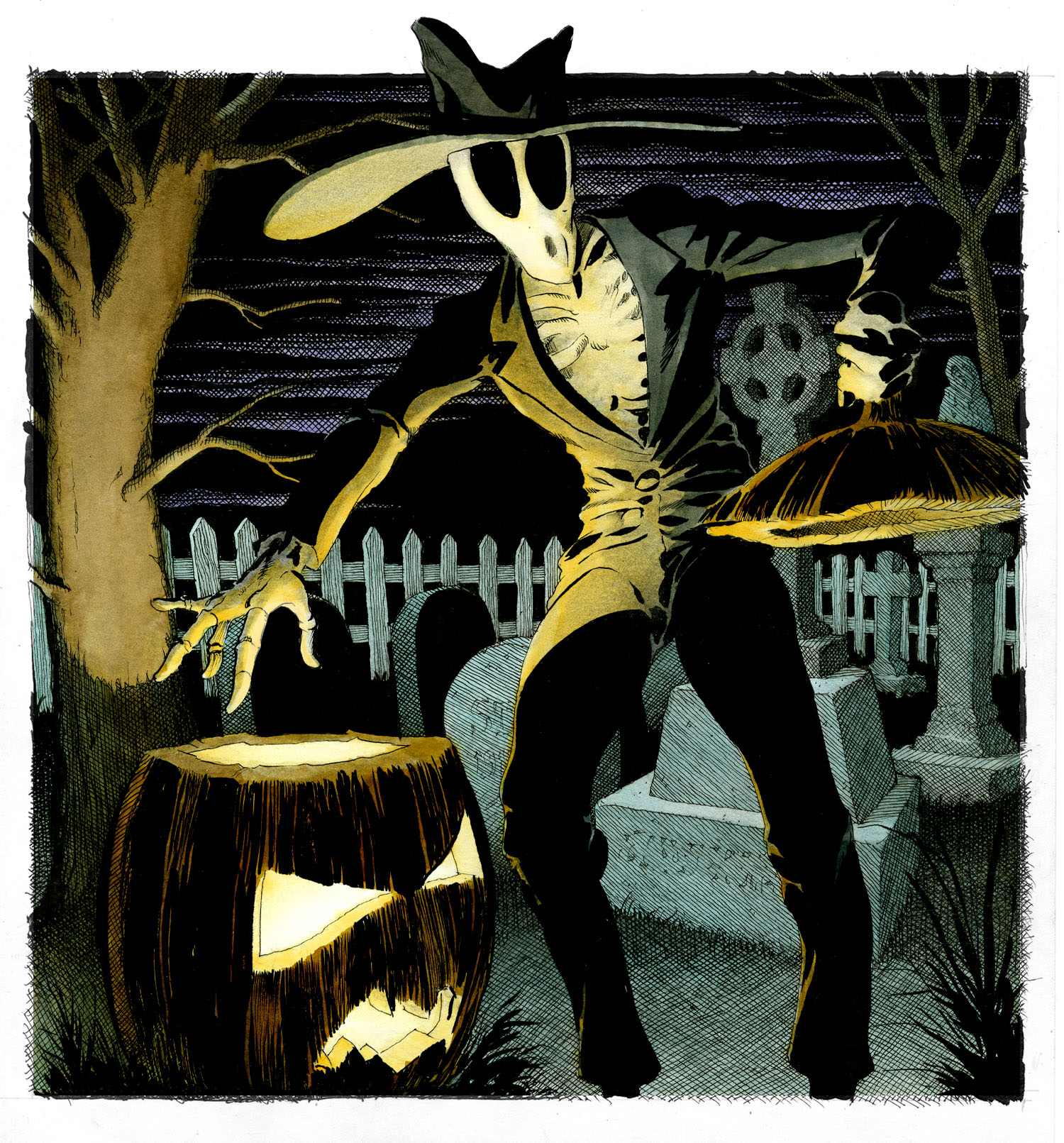
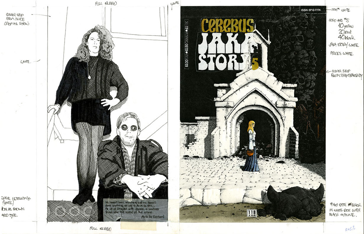
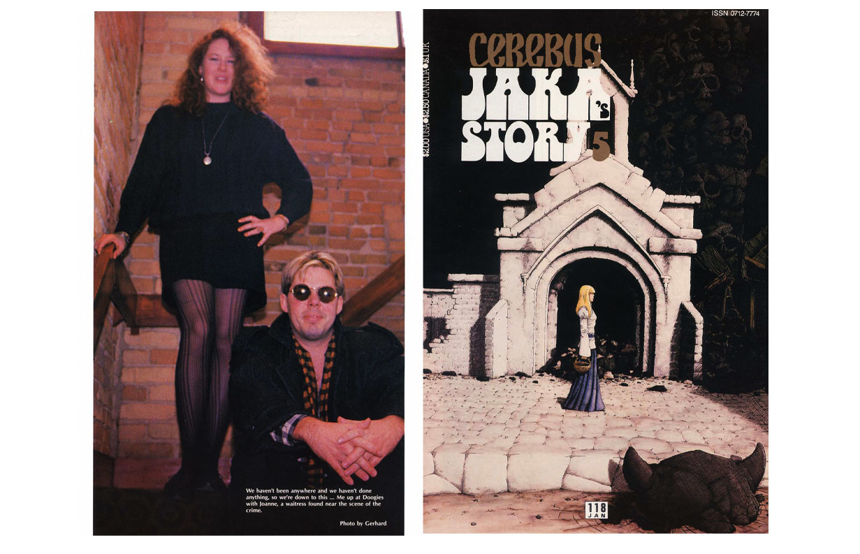
Followed closely in another post by Gary Boyarski about Dave’s Jack Grimm drawing:

‘…Being also on good terms with Gerhard, I asked him to color the piece, which he not only agreed to do, but he also did his “Gerhard thing” and embellished the background.
I thought it was fantastic!
Dave did not. He didn’t want it to appear that he and Gerhard had worked together on this art. He said I could still publish the Gerhard version, but asked that I remove his (Dave’s) name from the credits…’


I. Am. Outta. Here.


Posted on

Grimm News…

Gary Boyarski, creator of ‘Jack Grimm: Harbinger of Death’ asked me if I would digitally colour a drawing that Dave Sim did for him:

When it came time to do the colouring, I decided that what I really wanted to do is give it the “Gerhard Treatment”.

So I digitally erased Dave’s backgrounds and printed that out full size:

Then I drew my own background in the manner to which I’ve become accustomed:

And then hand-coloured that:

Gary was quite surprised.


You can find out more about Jack and his Harbinger-ing here:

https://www.facebook.com/JackGrimmComic/

Posted on

Yet Another Mock-up…

…very rough sketch of the back cover photo and no hand colouring on the front cover photocopy:

…looks like I may have finally figured out that I was spending too much time on these mock-ups.

Here’s the printed cover:

(The expression on Dave’s face is what I believe is referred to as a “shit-eating grin”.)

The “Zee” in the back cover caption refers to “Zolastraya” (not her real name) who some of you may remember was featured in her own (short-lived) comic book:

Man… the late ’80s… what were we thinkin’?

Posted on

More Mock-ups!

The cover mock-up for Cerebus 118:

As usual, I did a quick sketch of the back cover photo to indicate size and position to the printer. The sketches were done by projecting the slide photo onto the paper and tracing it with a marker. It was very quick, efficient, and sort of fun.

What I don’t remember or understand is why I hand coloured the reduced photocopy  of the black and white cover art. It’s not like I had a whole lot of time to spare while maintaining a (more or less) monthly schedule AND being in charge of the day-to-day operations of the company. Maybe it was practice before I coloured the full size original? It couldn’t have been “just for the fun of it”.

Here’s the printed cover:

The photo was from “Doogies”, a little restaurant almost directly across the street form the studio.

For years, we went there practically EVERY DAY for lunch.

Posted on

Still Waters…

The drawing I did for Chris Opperman: on the piano during recording and on the CD cover…

…and a Kickstarter:

“…The stunning artwork for the album was drawn by famed Canadian comic book artist Gerhard. I spent a lot of time as a teenager marvelling over his technique in Cerebus, and it was a dream come true to have him make this piece for me. It’s the first time in the history of my music that I’ve had the album cover done before I even recorded a single note! It’s also amazing that Kimberly Osberg’s piece is in some ways a tone poem based on the cover art! It will also be on the piano while I’m recording my own original pieces (obviously I’m also going to be one of the composers featured on my album!) and I am sure it will be very inspirational…”

-Chris Opperman

Very cool.