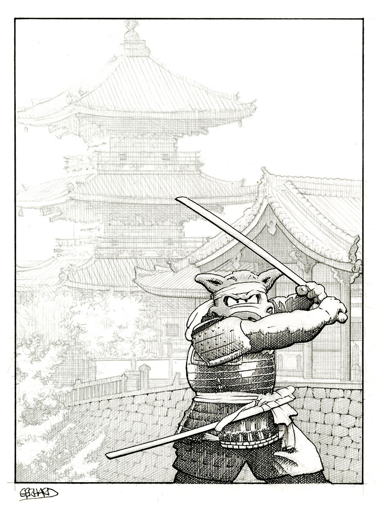
The cover mock-up for Cerebus 118:
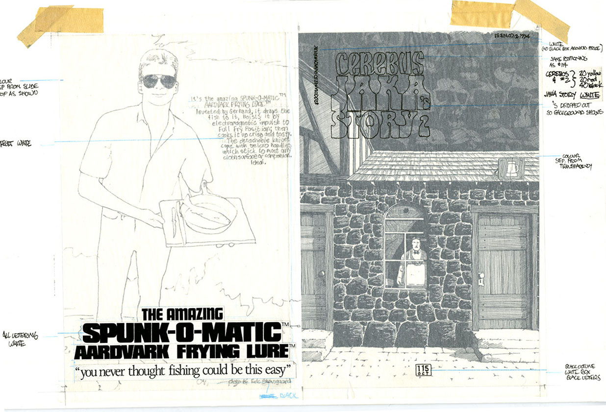
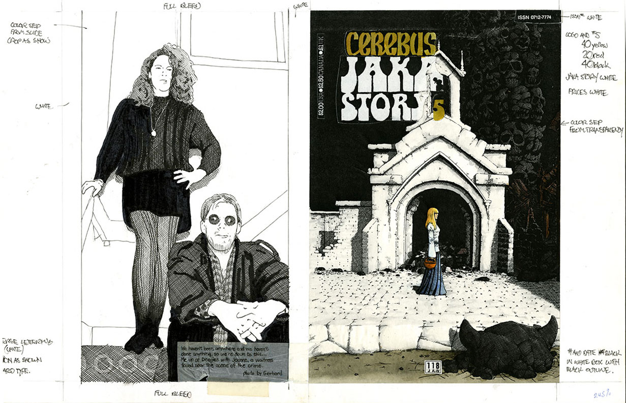 As usual, I did a quick sketch of the back cover photo to indicate size and position to the printer. The sketches were done by projecting the slide photo onto the paper and tracing it with a marker. It was very quick, efficient, and sort of fun.
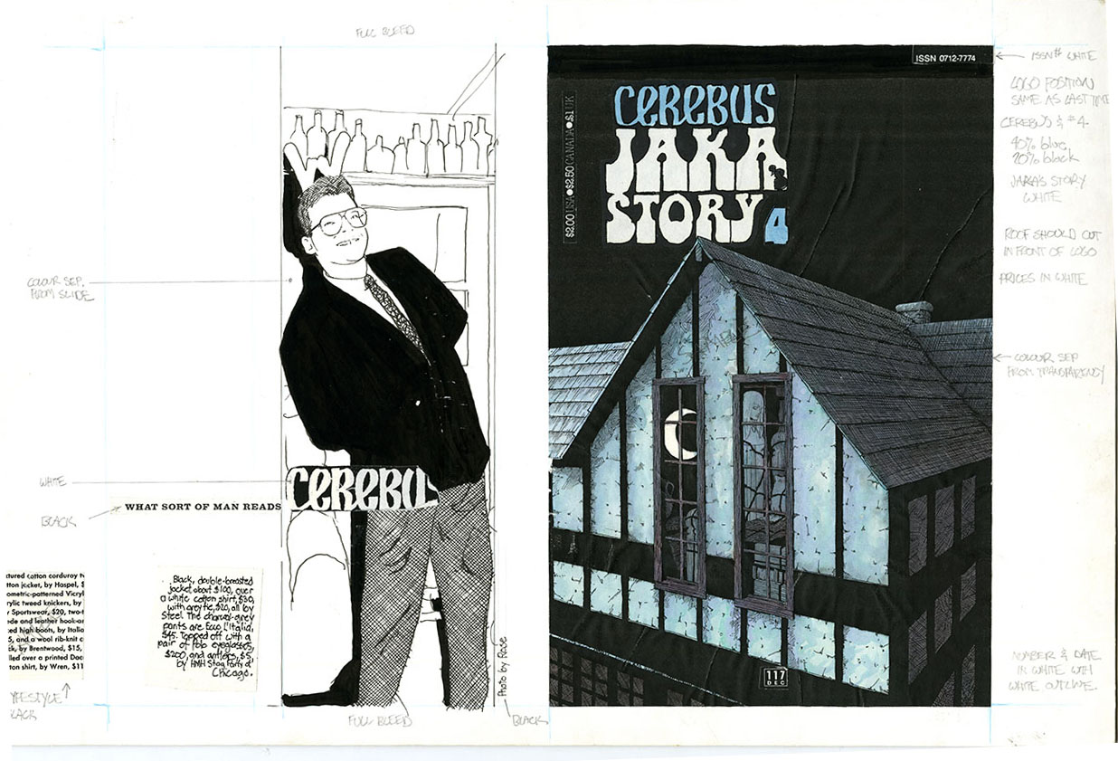
What I don’t remember or understand is why I hand coloured the reduced photocopy of the black and white cover art. It’s not like I had a whole lot of time to spare while maintaining a (more or less) monthly schedule AND being in charge of the day-to-day operations of the company. Maybe it was practice before I coloured the full size original? It couldn’t have been “just for the fun of it”.
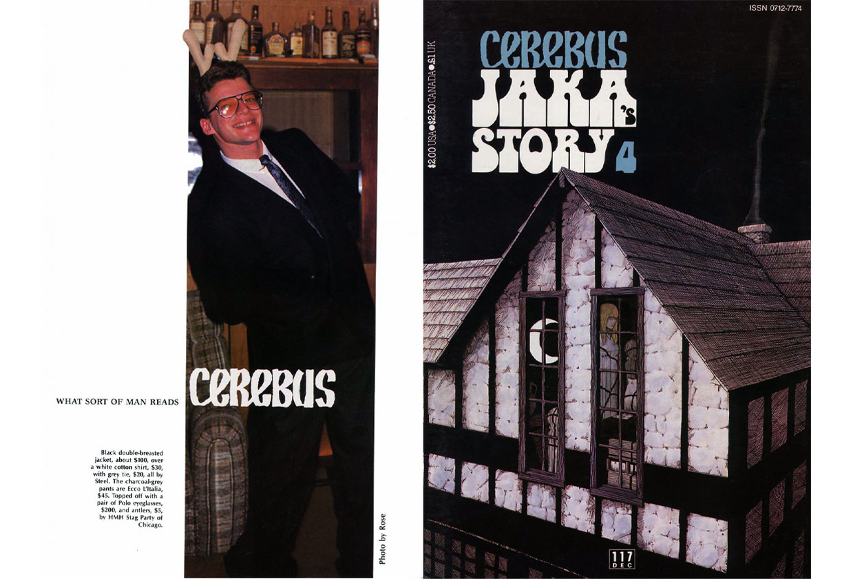
Here’s the printed cover:
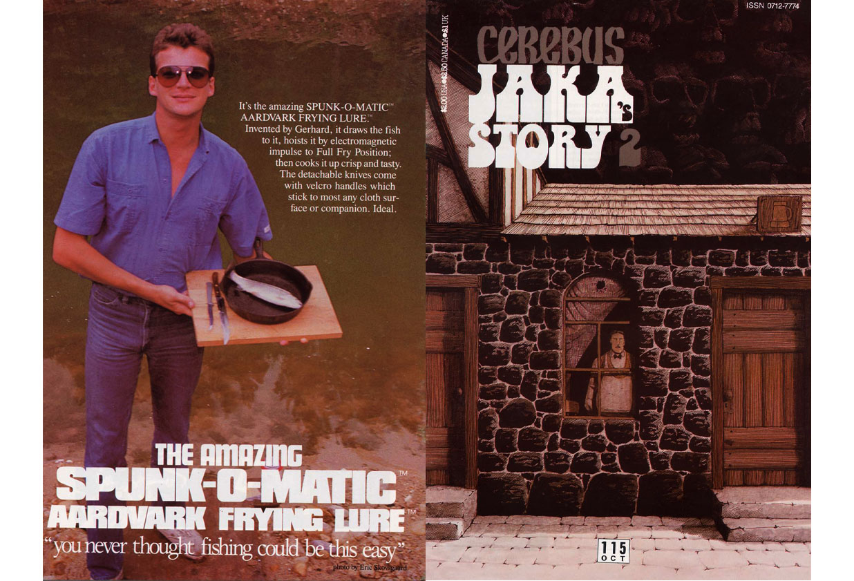
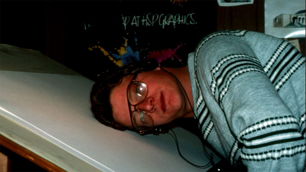
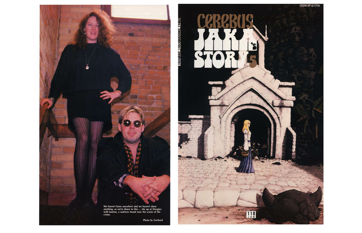 The photo was from “Doogies”, a little restaurant almost directly across the street form the studio.
For years, we went there practically EVERY DAY for lunch.
You must be logged in to post a comment.