Tracing paper rough:
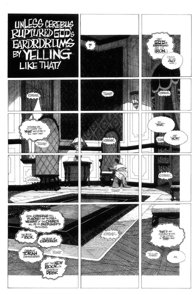
Final inked page:
Repeat as necessary.
Here’s a technique that I rather enjoyed… a single, large illustration broken up into many little panels:
This allowed lots of thoughts to take place with a sense of the passage of time while I only had to figure out one background.
 The reason this background is inset (the white border top, bottom and right side) is to tie it into the previous page where the background actually starts.
white space = no crosshatching.
Continuing with my tracing paper prelims…
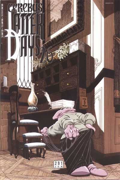
This looks to be for the cover of Cerebus 291:
it is:

The Cerebus character was added later… digitally.
This was the first time that I used a computer rather than physically cutting and pasting.
(after all… it was 2003: let’s get with the new millennium)
I also did the colours on the computer.
Which means the original art still looks like this:
The little calendar on the side of the desk was added digitally as well.
I was working from home at this point and didn’t know that there needed to be a calendar there.
It doesn’t show up until issue 293:
Which means that Dave was working at least three issue ahead of me at this point.
He had drawn and lettered the calendar which I scanned and added to the cover.
You must be logged in to post a comment.