…and here it is:
Okay… what’s next?
…and here it is:
Okay… what’s next?
I got and email from Jimmy which read, in part:
“… I hope this isn’t too weird of a commission request. I’m trying to get commissioned pieces of comic character hands (can include forearm) that shows enough to give a clue as to who they are. I work with hands for my job so thought it would be cool to have commission pieces like this. I was hoping I could get a Cerebus hand or forearm either posed (as best as a single extremity can be) or with a signature weapon in hand. I have a “handful” of commissions like this already...”
For the record:
There is no such thing as a “too weird of a commission request“.
Here’s another commission that I had abandoned years ago. I liked it as a pencil drawing but Frank, whose grandparents this is, really wanted inked. I was absolutely convinced that I would fu@k this up if I tried to ink it, so I set it aside.
I ended up with a hybrid of inked with pencil shading that we both liked:
So there…
…right… I have a blog. Really should post something.
After my “Big Studio Clean of 2022” I decided to finish commissions that I’ve hanging around waiting for the proper inspiration/motivation.
You can wait ’til hell freezes over.
The only way to get inspired/motivated is to just sit down and
DO THE FRICKIN’ WORK!
So… here’s one that I had abandoned and that prompted me to institute a “No More Superheroes” policy:
Okay… what’s next?
Here’s a technique that I rather enjoyed… a single, large illustration broken up into many little panels:
This allowed lots of thoughts to take place with a sense of the passage of time while I only had to figure out one background.
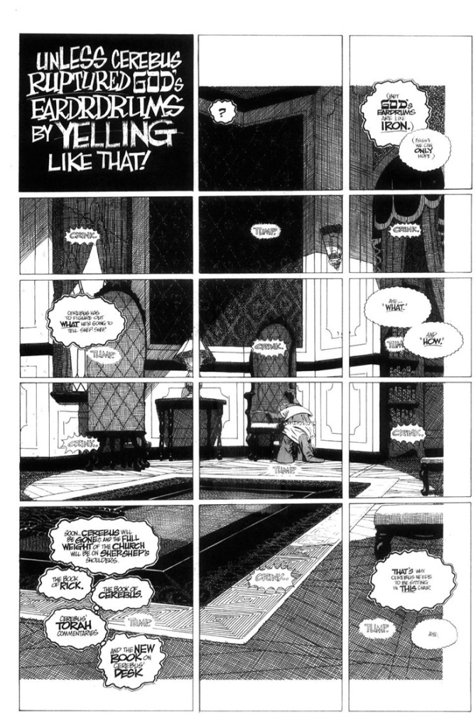 The reason this background is inset (the white border top, bottom and right side) is to tie it into the previous page where the background actually starts.
white space = no crosshatching.
Continuing with my tracing paper prelims…
This looks to be for the cover of Cerebus 291:
it is:
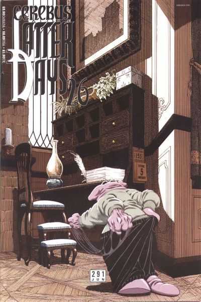
The Cerebus character was added later… digitally.
This was the first time that I used a computer rather than physically cutting and pasting.
(after all… it was 2003: let’s get with the new millennium)
I also did the colours on the computer.
Which means the original art still looks like this:
The little calendar on the side of the desk was added digitally as well.
I was working from home at this point and didn’t know that there needed to be a calendar there.
It doesn’t show up until issue 293:
Which means that Dave was working at least three issue ahead of me at this point.
He had drawn and lettered the calendar which I scanned and added to the cover.
Here’s another thing I came across in my Big Clean Up.
Way back in the olden days I had software called “3D Home Architect” running on our pre-Pentium 486 computer. I could design and furnish a room in floor-plan mode, then click on the 3D render button and go for a coffee or go back to my drawing board for awhile as mere tens of minutes later I’d have something that looked like this that I could print out:
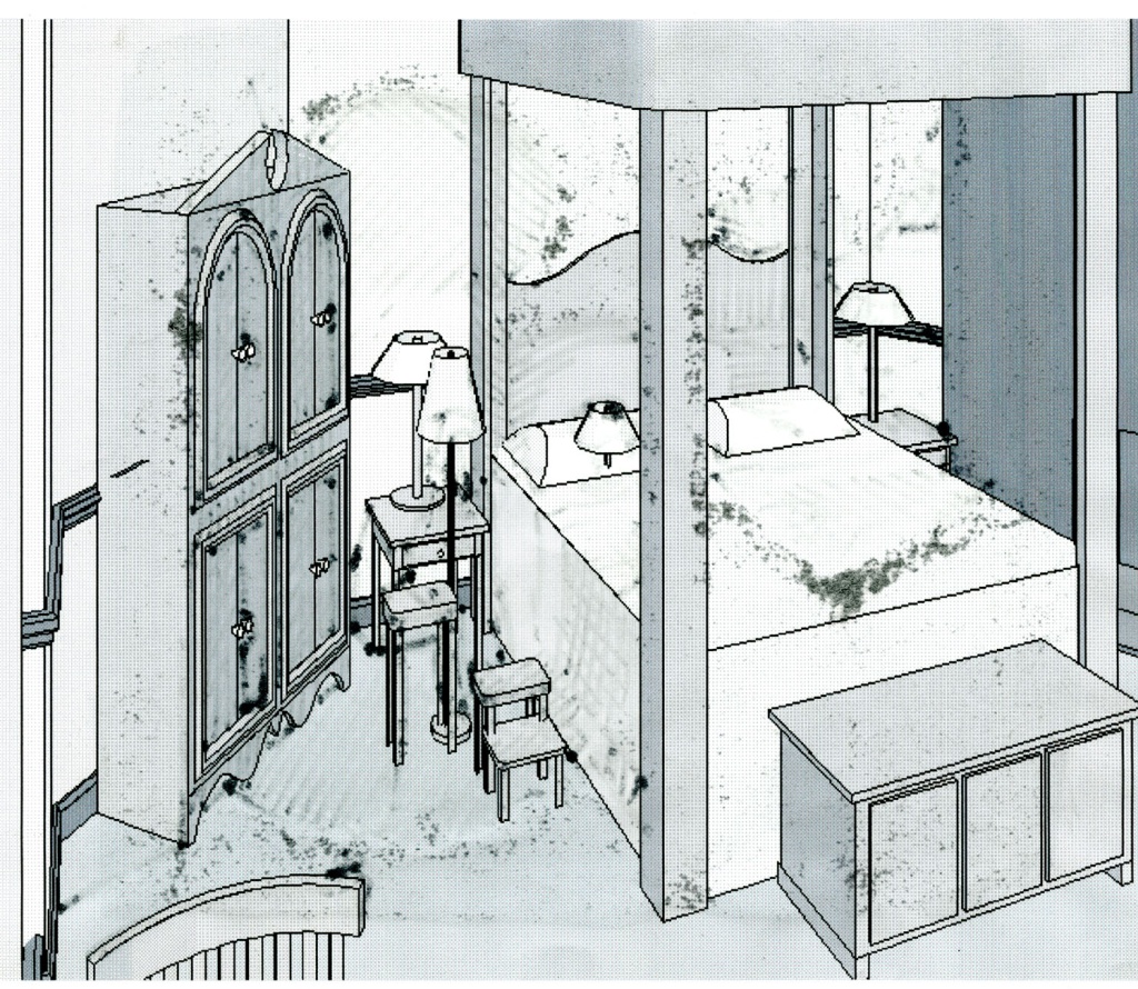
The lamp on the pillow and the floor lamp represent the characters. Lamps were easily resizable and positionable making them a great stand-in. The black splotches are from me drawing on back of the paper, on the light table, with a marker, very quickly figuring out what the lighting might be for this scene:
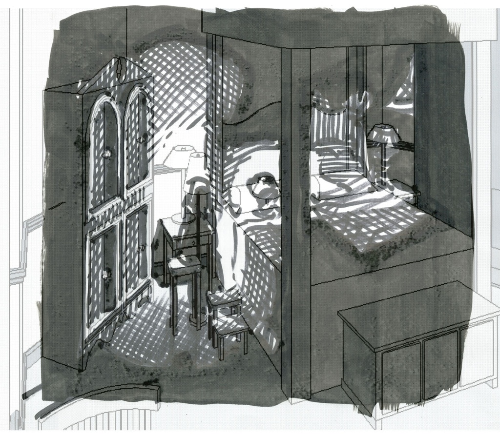
This was used as a guide to for the final renderings:
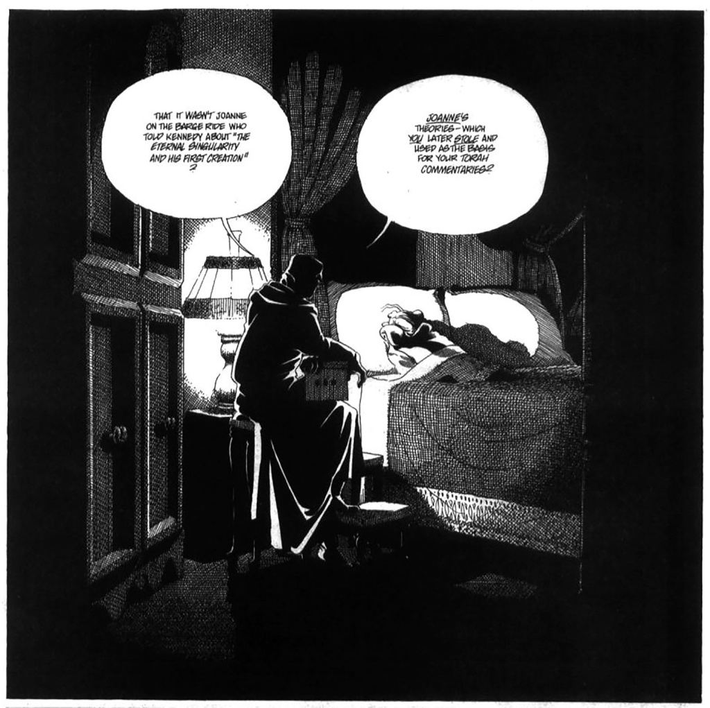
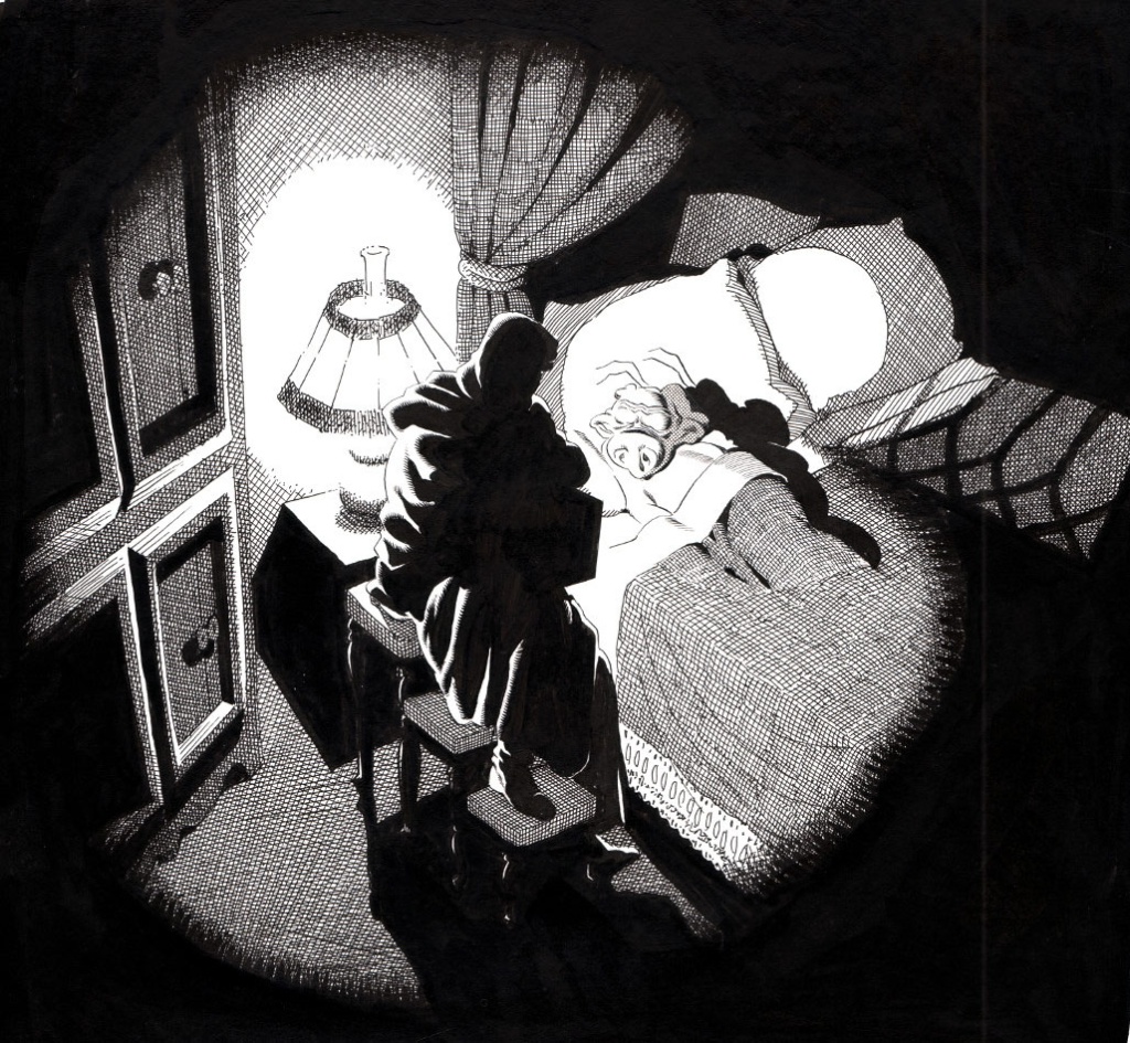
Here’s a good example of why I continued to use the “tracing paper transfer” technique. (Other than the obvious benefit of being able to… you know… trace stuff.) All of these roughed-in lines and perspective lines and otherwise unwanted lines would have to erased had I done them on the illustration board:
But by working out all that stuff on the tracing paper and then transferring only the lines that I intend to ink, I’m left with a nice, clean, smudge-free image to work on with very little-to-no erasing needed once the inking is done: 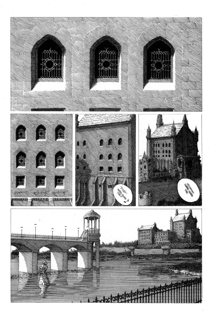 Which is a very good thing as sometimes erasing would lighten the inks from black to various shades of grey, severely affecting its ability to reproduce properly.
You must be logged in to post a comment.