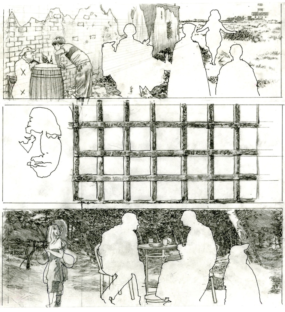
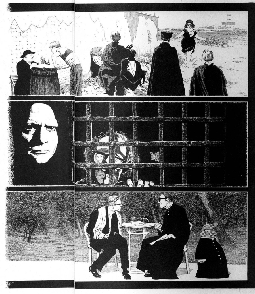
Here’s an example of a rare occurrence where Dave had me change what I’d done on the backgrounds.
In the bottom panel on the left side I put in a figure to balance the composition. Which I also did in the first panel.
(Another rarity: me pencilling and inking people).
 I tried to shoe-horn her in there. Apparently I couldn’t decide if she should be facing left or right.
Once the whole page was inked Dave told me that the girl was from a different Fellini film (or something) and that he WANTED an unbalanced frame to emulated/parody artsy-fartsy types of movies.
I almost invoked the “Interior of a Submarine” clause (in which Dave told me that I could do whatever I wanted with the backgrounds) but I was unhappy with the way the girl turned out.
(Usually, when something was a LOT of trouble to make fit, it meant: leave it out.)
So…
 In the bottom panel, on the left, you can just make out where I used white-out to cover the figure and then attempt to fill in the background.
(ANOTHER rarity: using white-out and inking on top of it… *yuck*bleck*gag*swoon*)
At least my little figures in the first panel made the cut.
You must be logged in to post a comment.