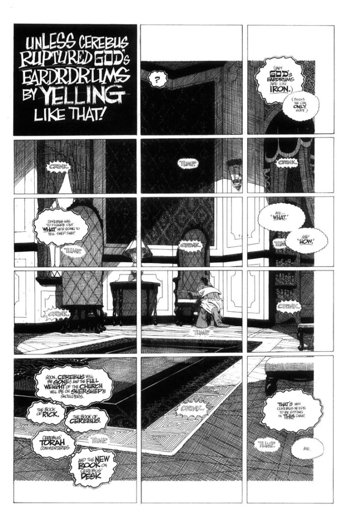
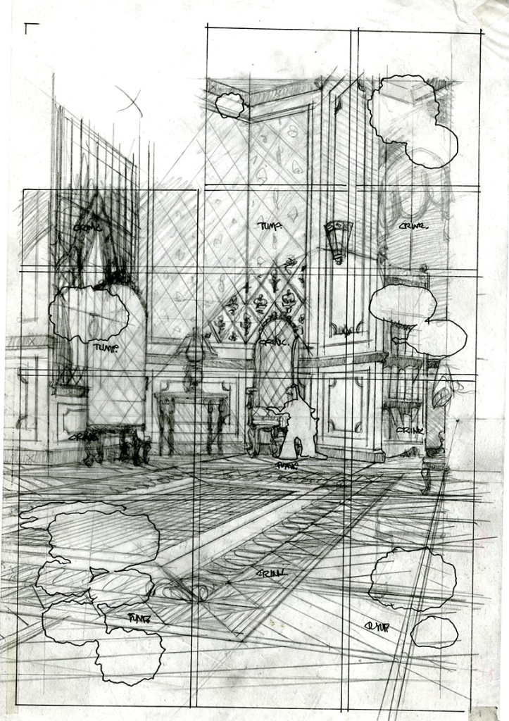
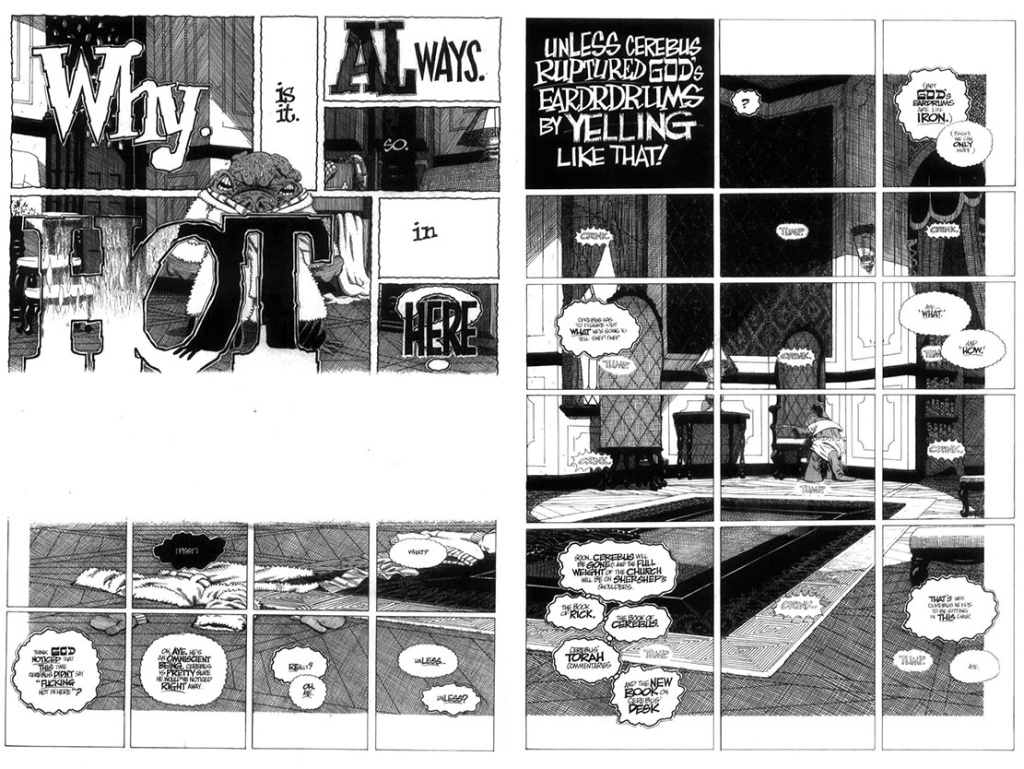
Here’s a technique that I rather enjoyed… a single, large illustration broken up into many little panels:
This allowed lots of thoughts to take place with a sense of the passage of time while I only had to figure out one background.
 The reason this background is inset (the white border top, bottom and right side) is to tie it into the previous page where the background actually starts.
white space = no crosshatching.


You must be logged in to post a comment.