Posted on

‘Climbing the Tower’ Take Two

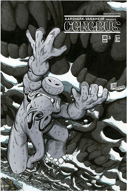
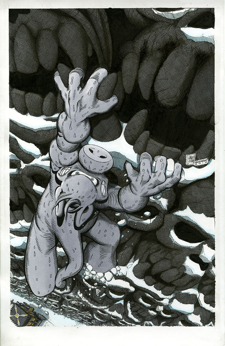
I received an email from Dean that said, in part, ‘…based on the previous information you had provided me on how you would normally receive a cover image from Dave, I painstakingly went through the commission image that Dave had done (which Dean owns), and removed the tone and the tower in the hopes that you might be interested in redoing the piece as a colour, painted piece. Similar to how you would have done a cover back in the day…’

Here is the end result:

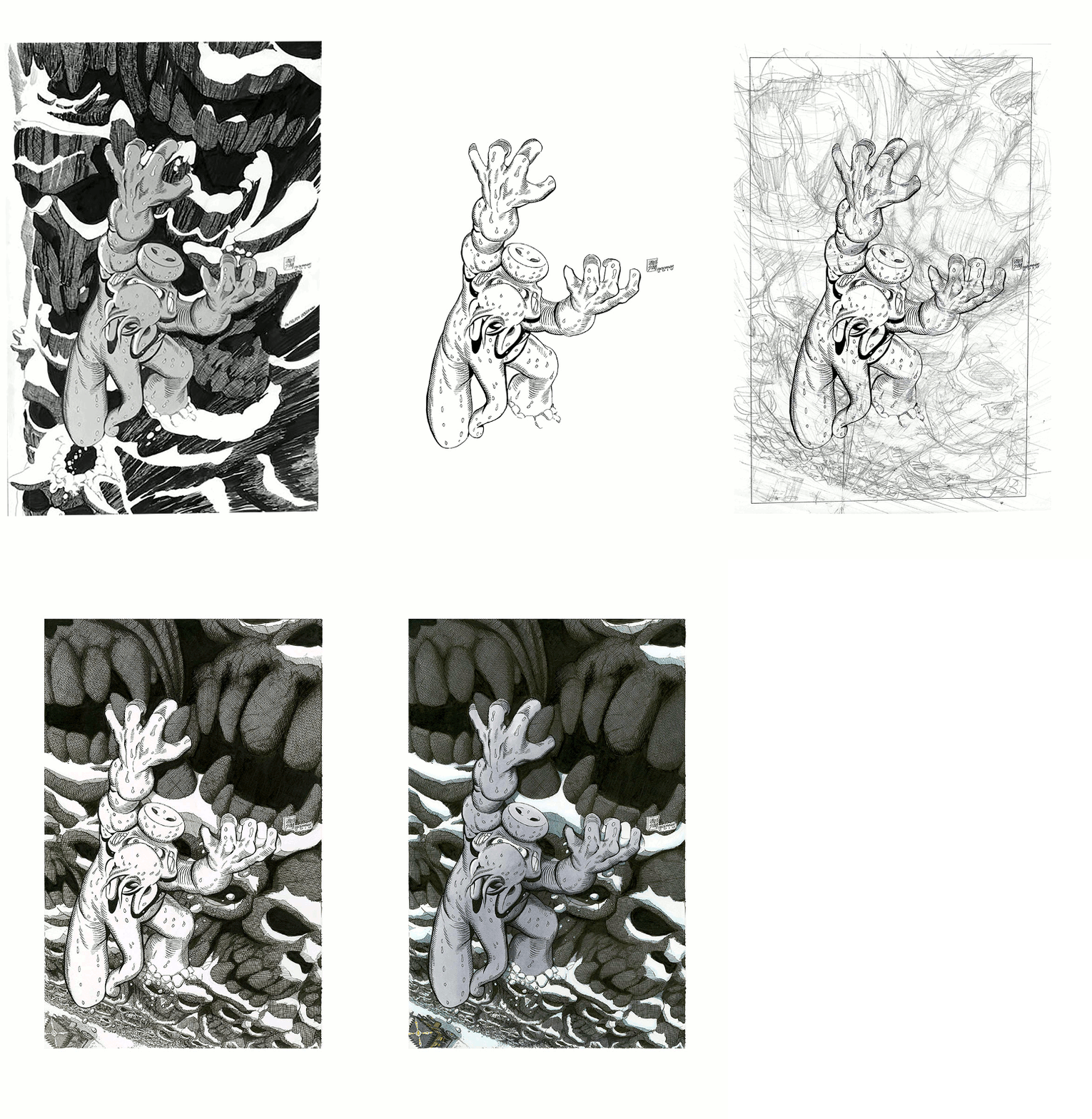
Here’s how I got there:

step 1: the original drawing by Dave

step 2: the image that Dean had created by removing all of the tone and backgrounds

step 3: my rough pencils around the Cerebus figure

step 4: my inks

step 5: my colouring

Here’s a GIF of the process:
An interesting little trip back 31 years to 1986, issue 86.

In a lot of ways, it seems like it was just three days ago…

…not three decades.

***

Update… email from Dean:

‘So I added the logo, issn number and the price to the cover to 86.5…you know…cause I’m a geek.’

I could start a whole series of covers that depict what happened between issues…

…call it, ‘Cerebus: Between the Covers’…

…nah.
Posted on

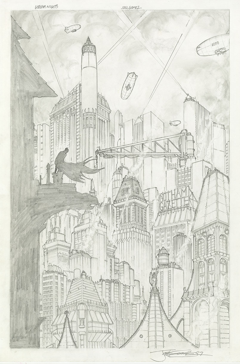
Gotham Nights

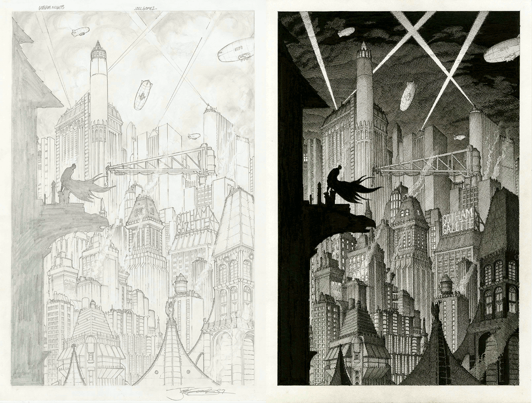
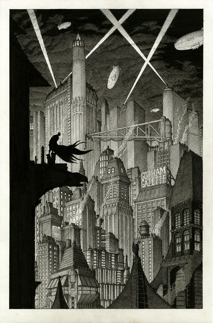
Duane commissioned me to ink Joel Gomez’s pencil drawing ‘Gotham Nights’:
He supplied me with the original pencil drawing and a print. He expressed a preference to keep the original pencil drawing intact, if possible. We discussed inking the print, but it was kind of dark and muddy. I had suggested making a lighter print of my own and ink that.
But then I decided to try something different… and do something the same way.
I used the original pencil drawing under a piece of Canson Bristol (my current favourite for drawing/inking) and put it on a light table. I was able to ink directly from what I could see of the pencils through the Bristol and used the print as a reference for the areas that were hard to see. That saved me from having to make a print that I would ink over and enabled me to use my preferred paper.
It was a very interesting process.
I had just finished the ‘Monkshood’ commission a couple weeks ago and decided that ‘Gotham Nights’ would benefit from the same sort of treatment. If I had inked on top of the original pencils, I probably would have done it completely differently and tried to keep closer to the original. But I figured Duane wanted me to ‘Gerhard-it-up’ (which usually means thousands upon thousands of tiny little lines) and I wanted to make it look more like night-time as well as try to give a sense of depth. I used a light grey wash on the sky and on the foreground buildings to enhance the effect.
Ta-da!
Posted on

Don, Steve and $crooge

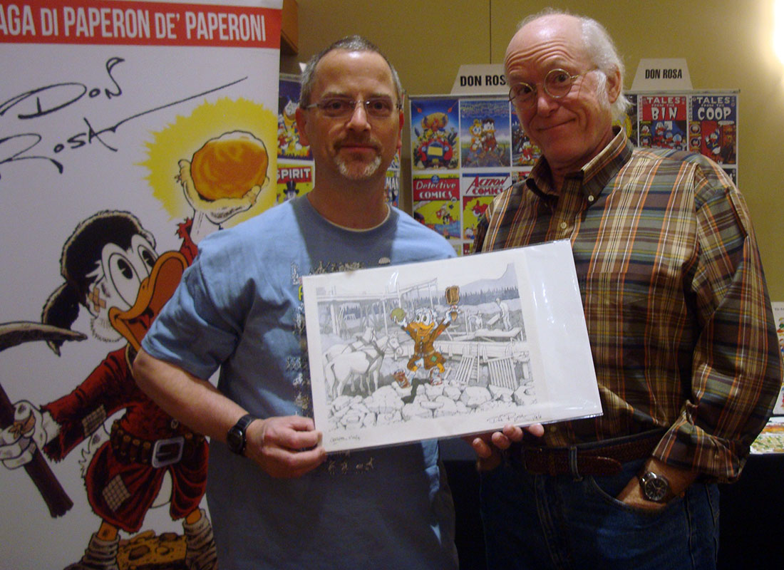
I got this email the other day:

“Hi Ger –

Hope you’re all doing well, welcome to 2017!

Don Rosa was in Albuquerque this weekend and I brought in the Yukon $crooge commission,

he was quite taken with how you finished out the background.

Thanks again and I’ll be in touch eventually!

Steve”

Thanks Steve…Way Cool!

Look forward to the next commission.

Posted on

“Monkshood” commission

Here is, in part, the description I received for this commission:

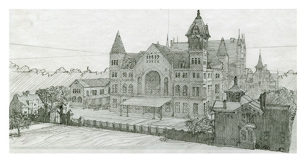
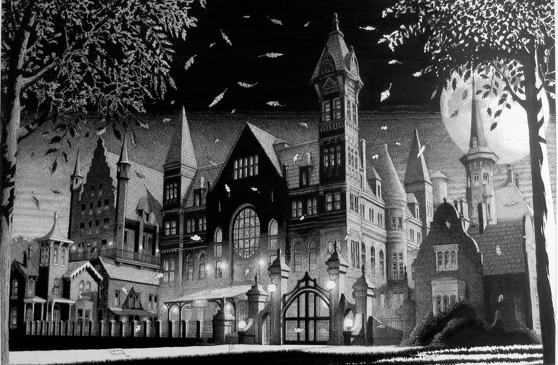
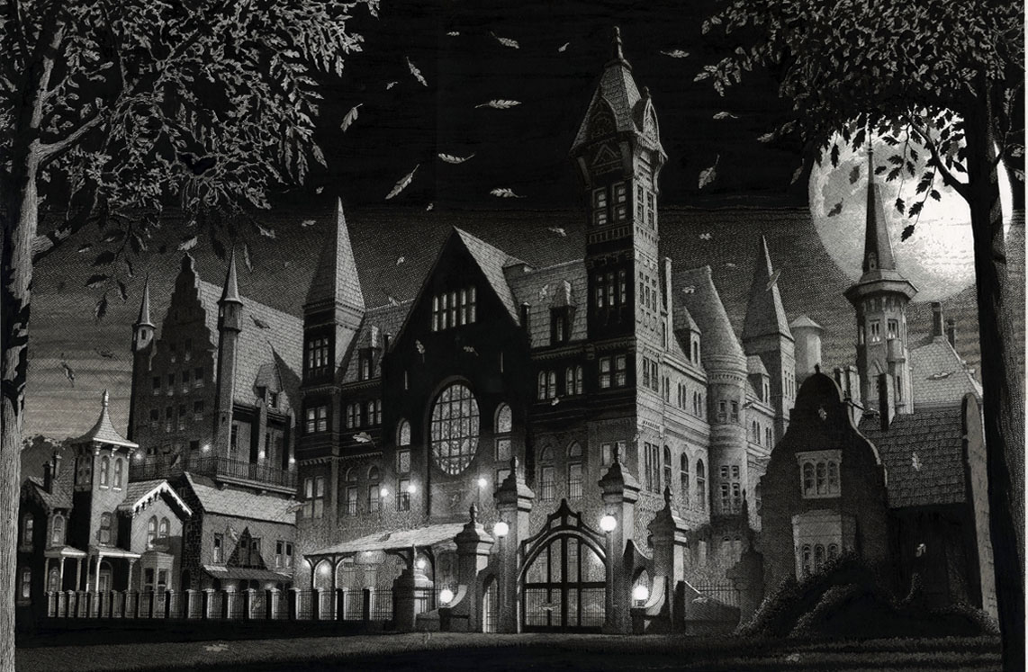
“Perhaps the best way to describe my project is a modern-day Dracula meets Arkham Asylum, but done in a way that represents people with mental illnesses, particularly those who have been found by the courts to be Not Guilty by Reason of Insanity. The main setting of my story is “Monkshood,” a forensic psychiatric hospital complex comprised of neighboring buildings from Dracula lore: Seward Sanitarium and Carfax Abbey, and influenced by real-world Broadmoor Hospital in the UK. Monkshood… should be a character in and of itself.”

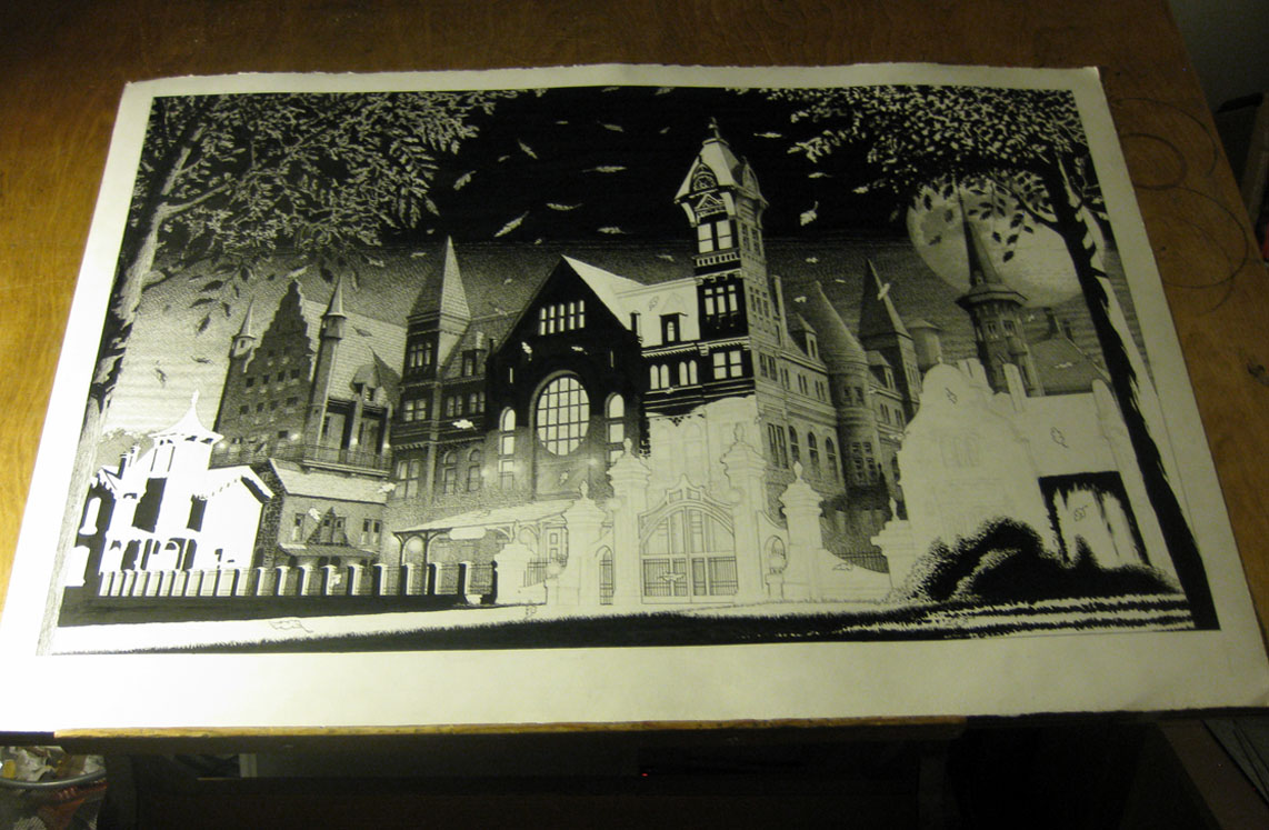
So with that in mind I came up with this layout:

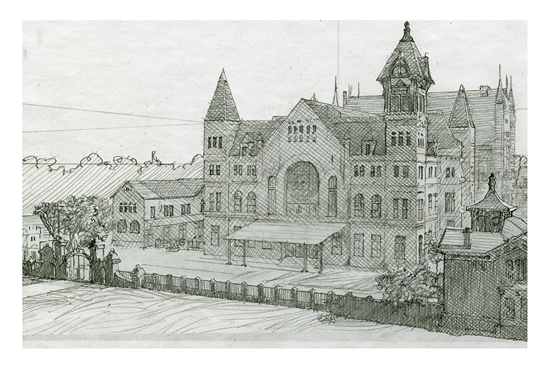
This seemed too wide and panoramic, so I cropped it down a bit:

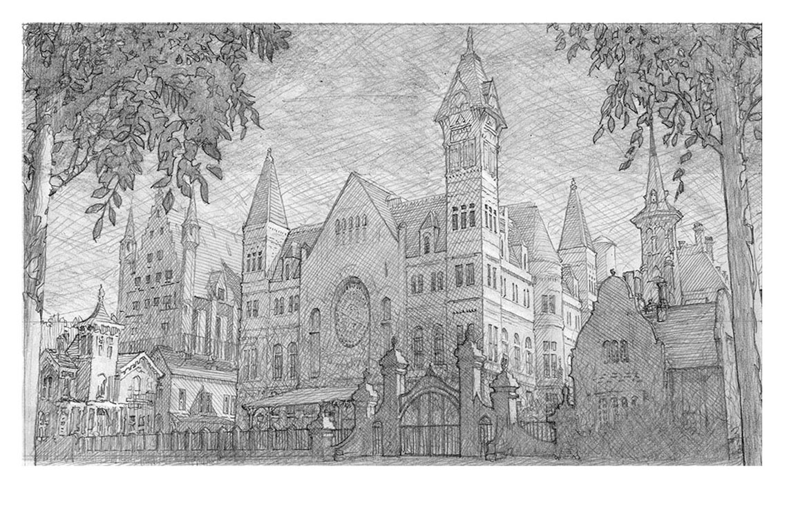
This didn’t look sinister enough, so I changed the angle and moved some buildings around:

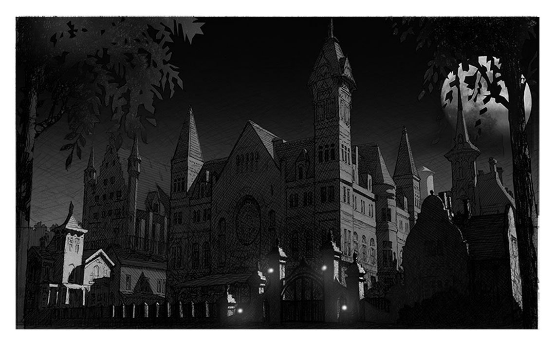
Then I did a mock-up on the computer of the shading:

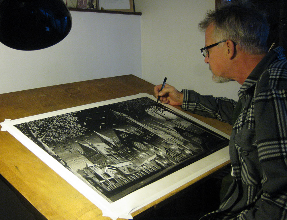
And then it was a matter of drawing it full size:

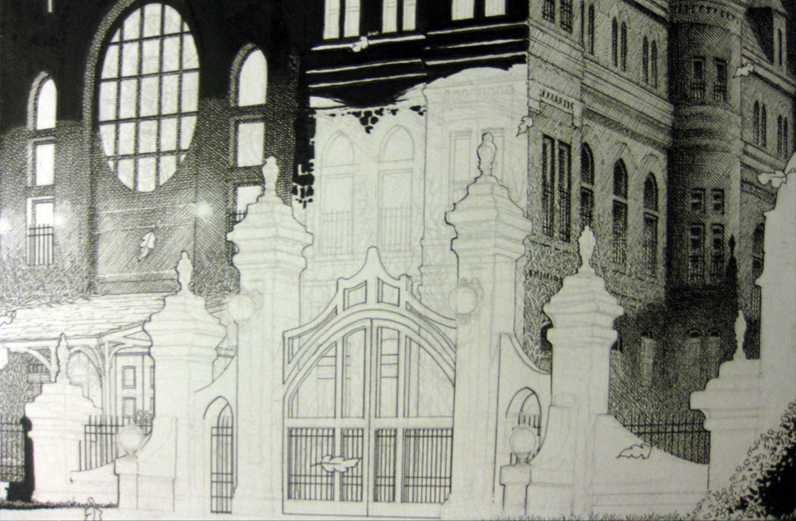
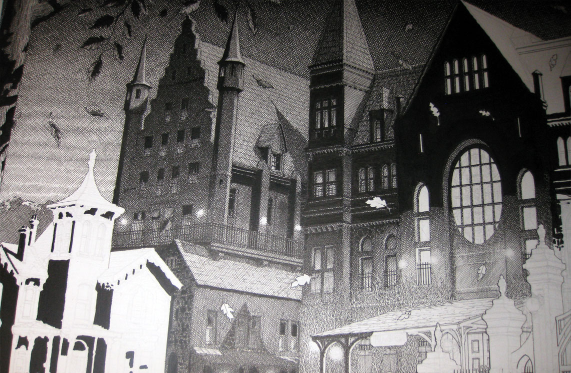
This is as far as I got before Christmas (so close!):

Here is the completed piece:

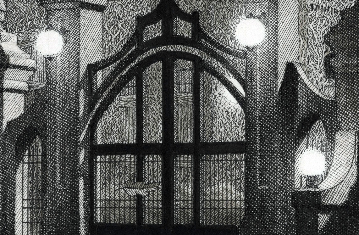
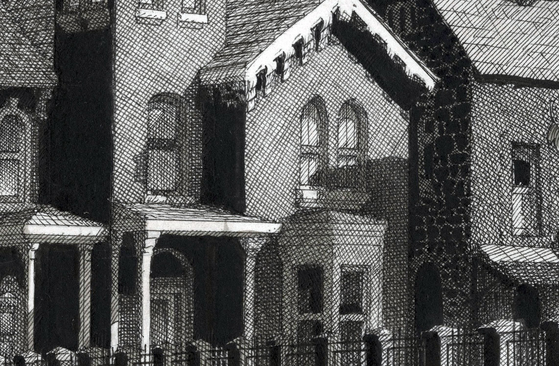
Here are some close-ups:

Ta-da!

Okay…what’s next?

Posted on

2016 cons ‘n’ commissions

Here’s a little movie compiling all of the con and commissions from 2016:

Wishing all of you the best for 2017.

***

Here is our schedule so far for this year:

March 2 – 5… Emerald City Comicon… Seattle WA
March 17 – 19… Toronto ComiCon… Canada
April 14 – 16… Indiana Comic Con… Indianapolis
April 29 – 30… East Coast Comicon… Secaucus NJ
May 19 – 21… Motor City Comic Con… Novi MI
June 16 – 18… Heroes Convention… Charlotte NC
September 8 – 10… Wizard World… Nashville TN
September 22 – 24 – Hal-Con… Halifax NS Canada

Posted on

Catchin’ up on Stuff…

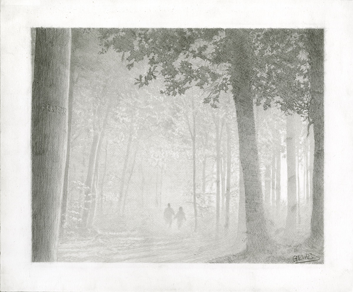
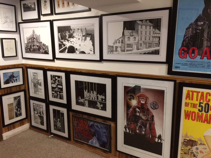
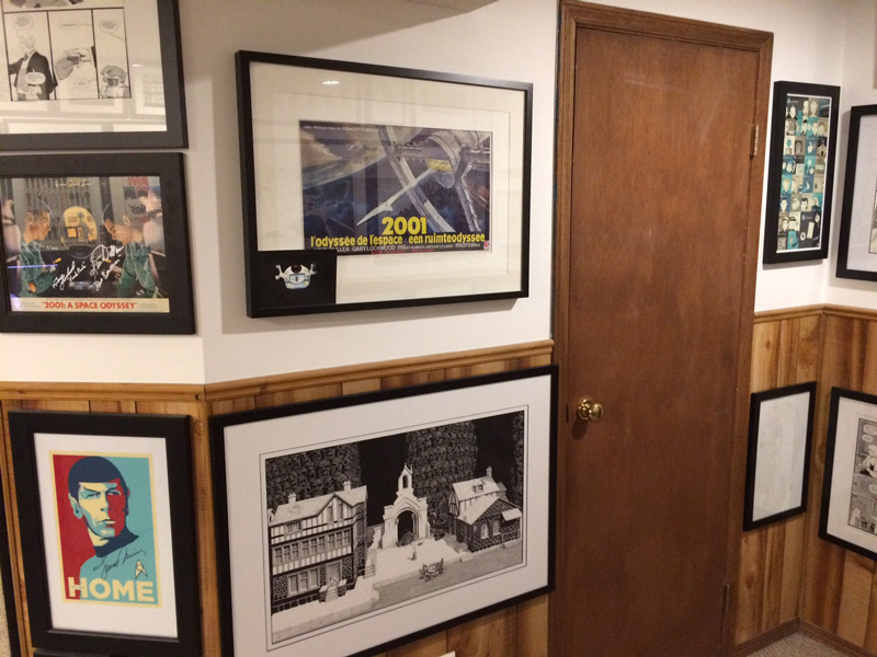
Here’s a pencil drawing I did for Mike:believe Here’s a couple of the shots Dean sent me of his awesome office featuring an impressive array of Cerebus art including the originals of the Regency, Church & State, Jaka scene and Melmoth street that I did for him:

office-shot-1office-shot-7x

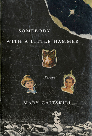
This is the cover of an upcoming Penguin Random House book by Mary Gaitskill

that uses the image from Church & State vol II:

somebody-with-a-little-hammer-by-mary-gaitskillx

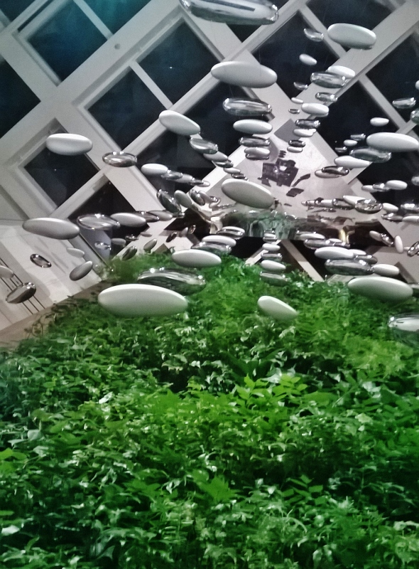
And finally, just a cool shot looking straight up in the lobby of the hotel in Pittsburgh:

wp_20161105_002-590x800

x

To all our American friends, Have a Happy Thanksgiving!

x

Posted on

Dining at Dino’s

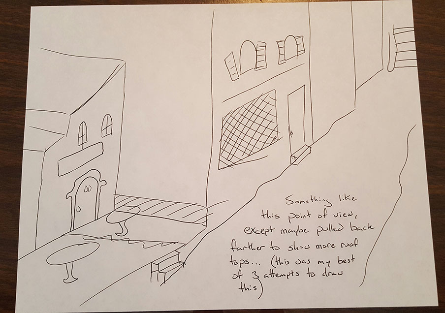
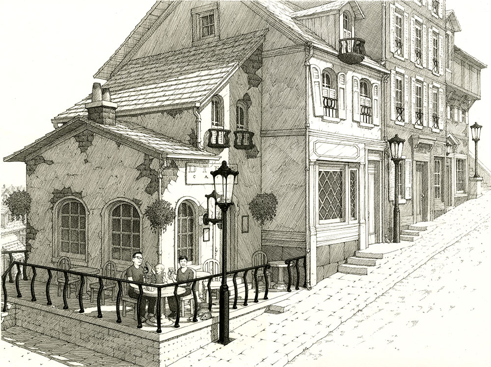
I received a commission request to have a family pictured on the patio at Dino’s Cafe from the Melmoth Street Scene.

He even sent me a sketch he had done to help illustrate his idea:

01sketch

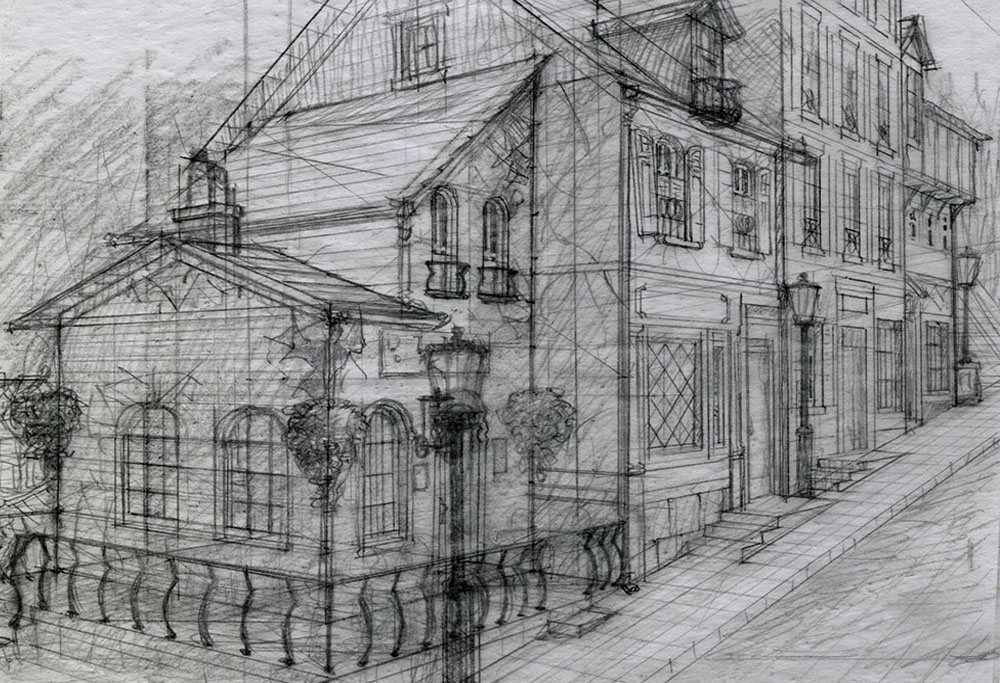
That sketch, along with his rather detailed instructions, helped me to produce this layout:

02pencil-rough

Which led to this finished inked drawing:

03ink

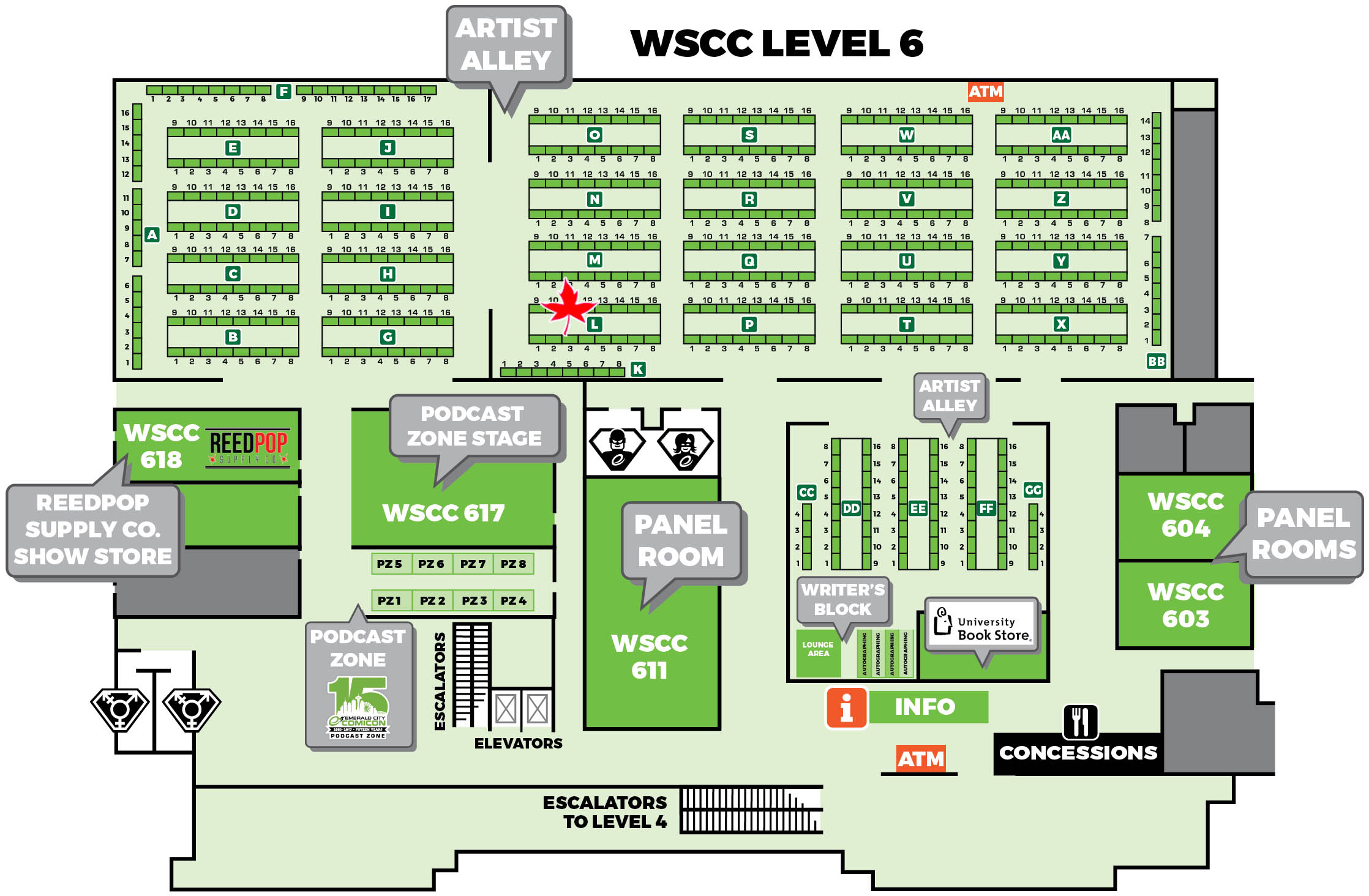
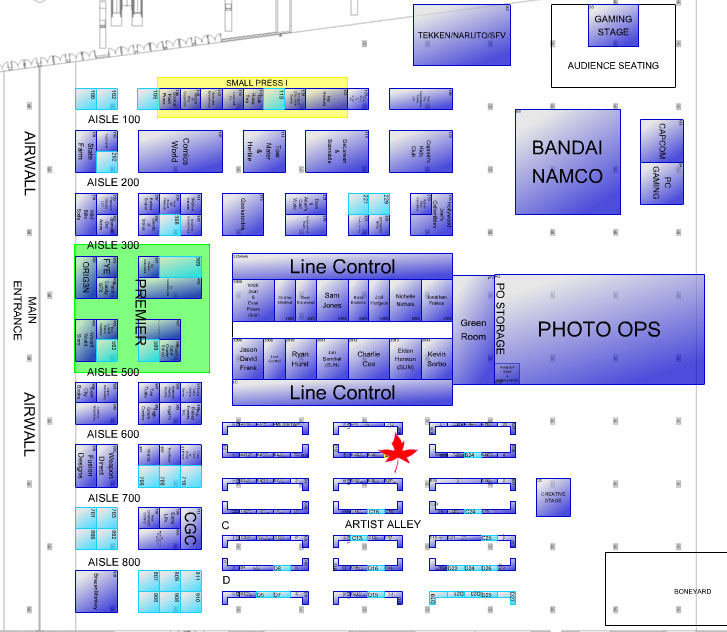
We’re off to Wizard World Pittsburgh on Friday and will be at table B-18:

pitts-map

Our last show of the year!

Come on down!

x

Posted on

Colours, Covers and Absent Cats

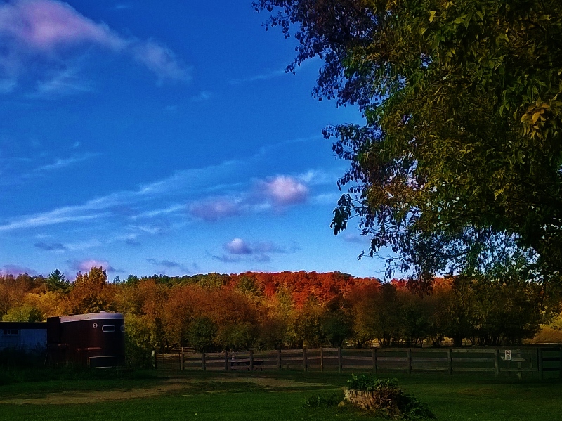
The colours out back of Pride Stables during our fall session:

wp_20161019_001-800x599

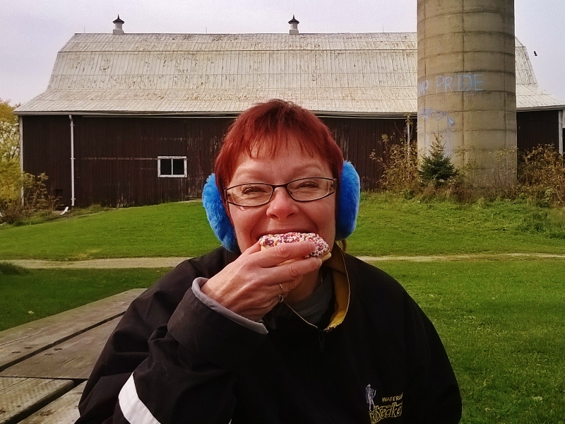
The colourful sprinkles on Shelley’s birthday doughnut:

wp_20161026_004-800x600

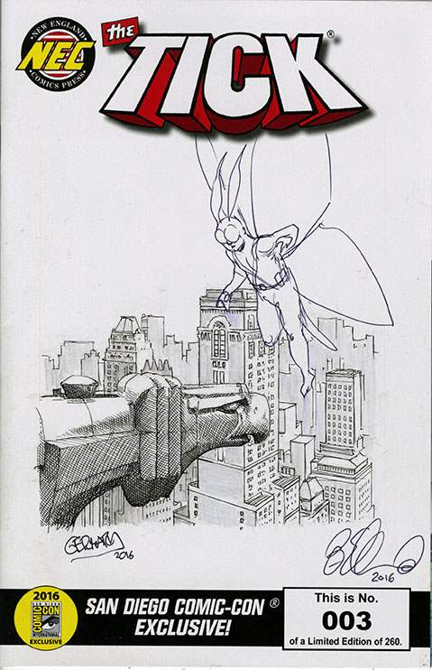
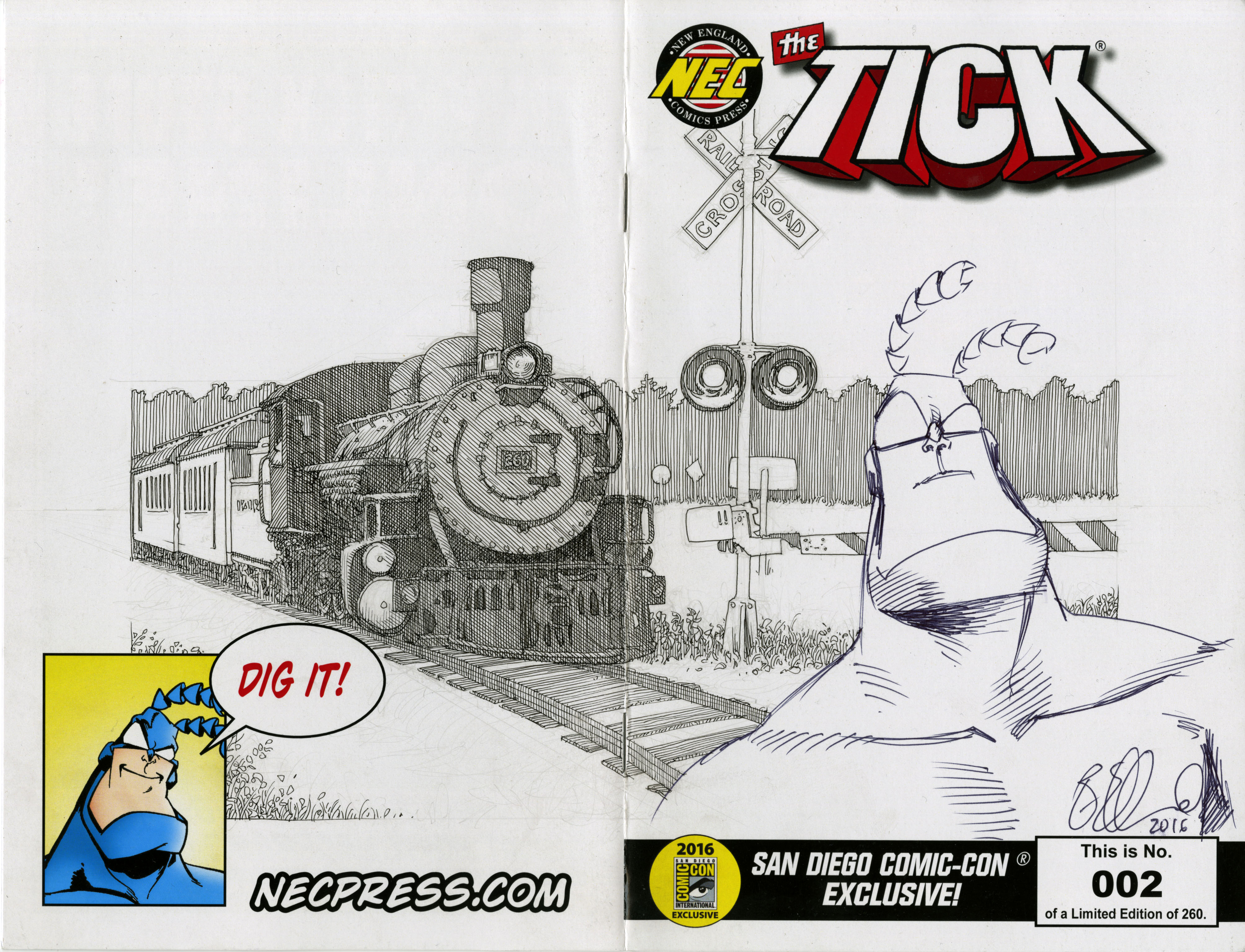
The sketch covers I did for Charles:

arthur2tick2

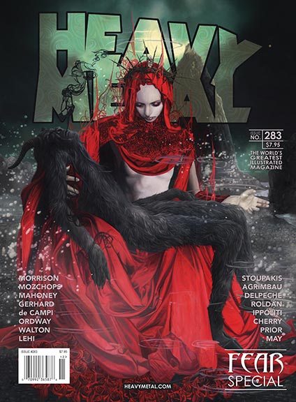
The issue of Heavy Metal magazine with my art for ‘The Smile of the Absent Cat’ story should be on the shelves.

Now I just have to find me one of those shelves.

heavy_metal_283_cover_a_small

Posted on

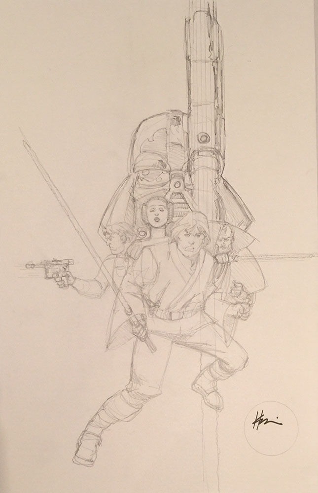
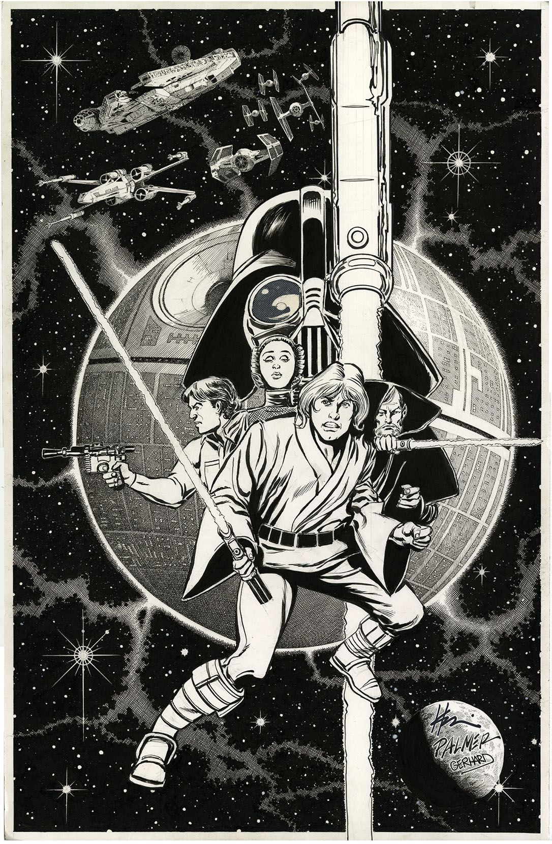
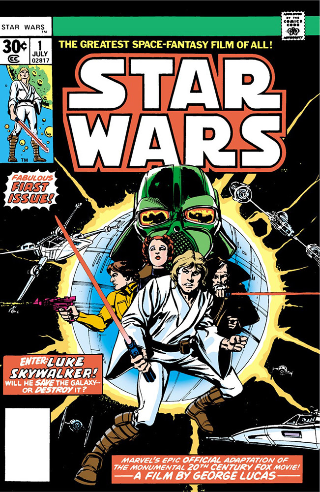
Star Wars #1 cover re-creation

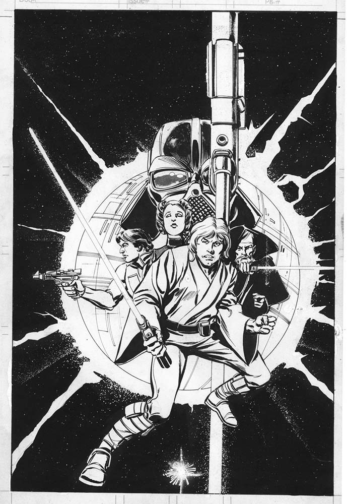
Charles somehow convinced Howard Chaykin and Tom Palmer to re-create their cover for Star Wars #1 published in 1977. Here is an image of that cover:

00000 Mswc1cover

and here is the original inked version before all the other stuff was added:

original ink copy

Here is Howard Chaykin’s new penciled version:

000 Star_Wars1_Pencils

and Tom Palmer’s inked version:

00 ink

and here’s my bit (click to enlarge):

final

This should be a link to a little video of the process:

star wars